Delta Wright

DOCENT Briefing No.14 | The Chill Guide To Art Basel Miami

Delta Wright

Hello and Welcome to DOCENT - your guide to design intelligence, creative solutions and earthly beauty.

Today’s DOCENT Briefing takes a refreshingly chill approach to planning a trip to – the Olympics of the art world – ART BASEL MIAMI.

Starting in late summer, art lovers, fashinistas and celebrities start planning their annual trek to Miami for a whirling week of epic art, chic dining and glitzy socializing. There are loads of resources online from insiders advising you on “what to wear”, “where to stay” and “where to eat”, this guide is not about that. 

My goal is to offer a relaxed approach to navigating the fairs for clients, collaborators and friends who are interested in discovering extraordinary art in the range of $1,000 - $50,000. The fair experience can be hectic, even overwhelming at times, but also offers a wholly unique opportunity for art lovers and emerging collectors. The clearer you are about what you want to experience, the more rewarding the trip will be.

Miami2.jpg

THE BASICS

A quick note on the name to clarify the week’s events – virtually everyone talking about the event will call it Art Basel Miami (ABMB), however technically it is Miami Art Week. ABMB is the anchor fair and is by far the most prestigious and largest one, so naturally it’s brand dominates. Some of the world’s most important collectors, museums and art historians descend on Miami for a few days and the red carpet is rolled out for them. 

For the 2019 edition, events kick off around December 2 and last until December 8th, with VIP and invitation-only events occurring between December 3 - 5th.  It is well known that highfliers depart Miami by the time the fairs open to the general public on Thursdays. These vernissage times – private viewing of art prior to public opening – allow serious buyers to see and purchase high-status works in a more exclusive atmosphere. Out of the 83,000 attendees of the fair in 2018, less than 10% were art buyers, so it makes sense to create dedicated time for collectors.  

Besides ABMB, there are at least 20 satellite fairs of varying focus, price point and quality. Each fair requires a ticket, which runs from $60 at ABMB to $10 at NADA. I include links to most of the fairs below and will make a few recommendations later.

MIAMI BEACH ART FAIRS
Art Basel Miami Beach   |   Aqua Art Miami   |    Design Miami   |   Ink Miami    |   PULSE Miami Beach   |   Scope Miami Beach   |   Untitled, Miami Beach

MIAMI ART FAIRS
Art Beat Miami   |   Art Miami   |   Context Art Miami   |   Miami River Art Fair   |   NADA Miami   |   Pinta Miami   |   Prizm   |   Red Dot Miami   |   Spectrum Miami

Art-Collecting offers a helpful synopsis

Miami.jpg

THE OPPORTUNITY
There is no event currently on planet Earth that has catalyzed and organized so much art, design and culture as ABMB. The tropical setting and large presence of global galleries infuse the week with lush cosmopolitanism. Nearly 250 galleries from 36 countries travel with massive crates to present the best of their art treasures in Miami. The ability to see such a wide kaleidoscope of art, compare and contrast, and hone your art tastes is unrivaled. Whether you are an emerging or established collector, Miami offers the opportunity to find art you can’t live without. I say, go for it, at least once. 

THE VIBE
By now you are probably sensing the pulsating energy of the event. Miami completely gives itself over to art for the week. Whatever amount of energy you expect to encounter, I suggest to double it. The event grows in wonderful and sometimes weird ways every year and it is best to surrender to it. The best description I overheard likened the event to a medieval festival including  “the jugglers, the fire-swallowers, the hawkers, who all come to town and set up shop.” Did I mention attendees appear chilled-out-cool, despite the heat, the traffic and the crowds.  Must be something in the Miami water. 

SOME TIPS
Trying to cover it all?  Not possible.  A curated approach based on your specific interests works best. I recommend doing a bit of homework before hand and committing to 5 – 6 fairs that appeal to you to really enjoy the experience. Remember that in addition to the art, many of the fairs have put together stellar public programming featuring global thinkers and artists. Don’t miss out on the lectures and panel discussions. I think these fairs do an excellent job of balancing the commercial aspect of the event with thought-provoking public programs. 

3 days and two nights is a good timeframe to plan for. Once you hone in on your favorite fairs, buy a VIP ticket or request one from a participating gallery if have an existing relationship. Several of the bigger fairs like UNTITLED and ART MIAMI have effectively embraced technology to offer ticket holders digital calendars of special events and lectures. You can log in, see all events and RSVP when necessary. This is a new feature that dramatically eased planning last year. If you are looking for a more exclusive experience of events, I suggest looking into a CULTIVIST Membership. This “global art club” curates several private events for members throughout the week.  

Please don’t be afraid to engage with any dealer or gallery staff. I believe the biggest misconception of galleries is that they are unapproachable. These are dedicated professionals who are loaded with information eagerly waiting for you to ask a question. You might be surprised at how engaged, informed and efficient gallery staff is at the fairs. They are ready to serve and typically very happy to do so. That said, the set-up, sales and takedown of the week is high stress and everyone has their limits. Expect friendly professionalism – this is a sales event after all. The range of prices are quite large with most satellite fairs offering works between $1,500 - $50,000. If you are seriously considering buying art and not keen on gallery negotiations, considering hiring an art advisor to guide your trip and purchases. I recommend Los Angeles based art advisory and former museum director Maryna Hrushetska

Miami4.jpg

MY RECOMMENDATIONS
I trust you have the fashion thing covered but will emphasize the need for comfortable shoes, protein snacks and your favorite evening ensemble. On to the main stuff: 

FAVORITE FAIRS

DESIGN MIAMI, across from ABMB, a museum quality exhibition and celebration of the best high-end design around the world. 
SCOPE, held on the beach at 9th Street, specializes in emerging artists and multidisciplinary projects;
UNTITLED, located on the beach at 12th Street, highlights a curated selection of emerging and mid-career artists
NADA, located at Ice Studios, featuring younger, more avant-garde dealers and artists
ABMB, Miami Convention Center: 500,000 square feet of the most prestigious and expensive art around.  

HOTELS

THE SURF CLUB, this reimagining of Miami’s famous private club from Richard Meier and Joseph Dirand is a slice of heaven. A serene and luxurious sanctuary amidst the chaos. You will have to trek outside the main strip, but the rewards are worth it. 
THE EDITION, a serene, elegant and easy option from master hotelier Ian Schrager.  Convenient location, access to pristine beach and very sexy.
THE FAUNA HOTEL, centrally located this very unique collaboration between Argentine hotelier Alan Fauna and Baz Luhrmann has been described as “Great Gatsby meets Moulin Rouge”.  Even a coffee in this fantastical space is a trip.

If you can swing it, absolutely worth visiting Pérez Art Museum for its Herzog & de Meuron-designed waterfront building alone.

y0dlcikdokzcc8rqly1b.jpg

Hope this guide answers some questions and got you excited about heading to Miami in December. Most of all, I want you to have fun and discover art you love.  If you are planning to go, lets connect Miami style!

If you enjoyed this DOCENT Briefing, send me a note or feel free to pass it along to a fellow design enthusiast.

Until Next time -

Delta Sig.jpg

DOCENT Briefing No.13 | On Decorating: Layers vs. Elements

Delta Wright

Hello and Welcome to DOCENT - your guide to design intelligence, creative solutions and earthly beauty.

Today’s DOCENT Briefing takes a look at two useful decorating strategies: LAYERS vs. ELEMENTS. Underlying most contemporary interior decorating styles is one of these two schemes. In the LAYERS approach, the decorator masterfully creates a complex palette from a mix of color, pattern, texture and shape.The layers created by this multi-faceted palette cover the surfaces and forms of the room. This approach is often used in traditional decorating styles and creates a cohesive, harmonious interior.  With the ELEMENTS strategy the architecture of the space is highlighted by the careful selection of the many elements that fill the space. This working style has also come to be known as a "curated" approach. The elements consist of objects such as furniture, art, accessories, decorative light fixtures and window treatments and can extend to other less obvious components of the room such as the walls themselves. While each of the elements or objects in the room may have their own distinct color and pattern, they generally each appear as individual objects in the space. This approach is often used in contemporary modernist styles and can create a bold, artistic interior. I reviewed 1st Dibs "Rooms of Distinction"  along with a few other favorites to select these example rooms for further discussion...

DELTA WRIGHT INTERIOR DESIGN | ELEMENTS
I'll begin with a project of my own. In this collaboration with architect Michael Kovac we transformed the interior architecture of this 1920's Tudor into a warm minimal home. I carefully placed our client's art collection to introduce bold color and graphic elements - each holding their own space and integrity. Each element offers its own character to the environment - the live edge of the dining table floats over the polished stainless rockers alongside the tete-a-tete sofa and undulating polished stainless coffee table. The lighted fireplace volume is made from nordic onyx with canted bronze and is poised as a featured element. My favorite find was this pair of vintage crystal luminaires which I placed over the walnut slab dining table. Made from rings of tiny modeled glass cylinders, they are quite mesmerizing! In this simple yet elegant interior, even the sheers provide a strong element of symmetry. More images here...

47f7afcc-ca74-4fde-9b1f-68590004b097.jpg
122711ed-c7df-47b4-92a9-f44831bc6756.jpg

Lounge Chairs and Sofa | Minotti. Snake Coffee Table  | The Future Perfect

TOM STRINGER DESIGN PARTNERS | LAYERS
I'm taken by the depth of layering in this dark and dreamy dining room and foyer by Tom Stringer Design Partners. My eye is drawn to the layering which begins with the modeled wall finishes and graphic patterns on the carpet and drapery trims which then moves to even the abstraction of the selected art works. The texture of the chandelier made from gnarled rope and glass suspended above the spotted pony ottoman adds an additional layer of complexity to the interior. Working with a darker palette can be challenging. A feeling of heaviness can quickly ensue, yet here, the designer's highlighting layers bring balance with well placed injections of color to create a welcomed warmth.

8382ee9c-9f5e-47e9-84f4-8feb2a88d1dc.png
80bc5e48-6e61-4f46-9be8-71bc972d773e.jpg

SUMMER THORNTON DESIGN | ELEMENTS
I love this example because it offers a twist. At first look, it appears traditional in style. The layered approach would be a natural fit, however, the brilliant and daring Summer Thornton surprised me! In this elemental decorative expression, by painting the elaborate moldings, panels and trims one playful color, she makes the enclosure of the room itself appear as a freestanding element. She has cleverly done the same with the white lacquered ceiling. The seemingly mirrored surface becomes an element unto itself. This technique carries right through to the art and decorative objects. Each piece assertive on its own, yet gathered together in this fantastical living room. Summer Thornton says "Use colors and patterns recklessly". This could apply to either of the design strategies. As shown here, color itself becomes a highly purposeful element. l love this playful advice!

MARMOL RADZINER | LAYERS
Leo Marmol and Ron Radziner are known for their warm modern architecture and interiors. I selected this interior as an example because it too offers an unexpected turn. As contemporary modernist interiors so often do use the elements approach - I would contend that in this example, they have surprised us with rich layers. The interior beautifully utilizes the surrounding greenery as a foundational layer in the palette. Juxtapose this beside the textured fireplace material and the grain of the dark wood floor. In this room even the soft upholstered blocks of black leather create a matrix of shadows and floating forms on the cocoa colored floor. Of course, the select and intentional color placements add a big and bold layer of expression.

Extrasoft Multi-directional Sofa by Piero Lissoni | GRAYE

STUDIO SHAMSHIRI | ELEMENTS
The elemental nature of these rooms by Studio Shamshiri embody an uber chic charm. The choice of furnishings and forms are deftly selected and placed. The multicolored tile wall at the base of the kitchen becomes a soft backdrop for the space. This very particular shade of gold chosen for the wood work is a bold element even as it encompasses the stylized room dividers which make "windows" into the kitchen. The pair of Finn Juhl sofas in forest green across from a monastic dark stained dining set all hover gracefully above the wide-plank bleached floor which features an unusually large cathedral grain. The Cloud pendant by Apparatus looms lightly above. In the living room example below, I am beyond enamored with how each element placed in the room is singularly a quiet feast for the eyes yet each one floats effortlessly together on a blush and plush sea of silk on the floor.

61362314-023d-47e8-91dc-31591b288f1f.png

FRAMPTON CO | LAYERS
Saving the best for last, my most favorite decorator and former business partner, Elena Frampton of FRAMPTON CO does layers like Helen Frankenthaler does paint. In this dining room Elena created a decidedly monochromatic environment that upon closer study is teaming with subtle layers. The layers permeate the space from the gold luster and ecru cream of the traditional motif on the wallcovering to the canvas wrap on the hyper-modern "Mummy Chairs" by Edra. Look closely to see the alternating stripes in matte and gloss on the ultramarine dining table. The gentle ombre of the rug lightens the room and slightly shifts away from the saturation of the room's walls and ceiling. The cascading crystal sconces and the silver foil chandelier highlight the scheme. By the way, are those dangling paint tubes?! Genius.

1e76e6a1-c2ac-451b-8641-c449ef34ee11.png

Elena's elegant work is captured by the watchful eye of photographer Joshua McHugh.

When beginning a new project, I want my clients to know the desired FEELING we will create together. Having a perspective on how to utilize LAYERS vs. ELEMENTS is one way to determine what will be the preferred decorating style for each client. Whether we build a complex and varied palette or curate an elaborate set of objects to be placed thoughtfully within the architecture, understanding these strategies gives us a point from which to launch. Happy Decorating!

If you enjoyed this DOCENT Briefing, send me a note or feel free to pass it along to a fellow design enthusiast.

Until Next time -

Delta Sig.jpg

DOCENT Briefing No.12 | 10 Q’s with DELTA

Delta Wright

Today I am launching 10 Q’s with DELTA – designed to get into the minds and hearts of creatives I admire. Expect some cool guests. I’m kicking things off by answering the Q’s myself, as told to my frequent collaborator, art advisor Maryna Hrushetska.

How old were you when you realized you were a born designer?
4th grade. I talked too much in class, so the teacher put me in a corner near a window as punishment. In my boredom, I started remodeling my bedroom in my head. Next thing I knew, I had sketched out a whole system of built-in storage. I created open curve shelving, a Lazy Susan for my furry friends and even built-in audio components. I showed my engineer Dad the plans and he made it happen! I got hooked on the design process and enthusiastically helped Dad with home projects until I left for college.

MY FIRST BUILT DESIGN, 1982. PROUDLY FABRICATED BY MY SUPPORTIVE FATHER, EDDIE WRIGHT. PHOTO TAKEN 1986. FORMER STUFFED ANIMAL LAZY SUSAN CONVERTED INTO HANGING AREA FOR THE STYLES OF THE DAY.

MY FIRST BUILT DESIGN, 1982. PROUDLY FABRICATED BY MY SUPPORTIVE FATHER, EDDIE WRIGHT. PHOTO TAKEN 1986. FORMER STUFFED ANIMAL LAZY SUSAN CONVERTED INTO HANGING AREA FOR THE STYLES OF THE DAY.

What two words would best describe your design style?
THOUGHTFUL BEAUTY. What I find most satisfying about design is creating spaces that feel good and nourish their inhabitants. I care deeply about my client’s well being and take the time to get to know what is meaningful to them.

Your motto is "Bring Soul Home", what gives a home soul?
A home that is handcrafted and heart-centered. A home with an aura of love. There should be personality and quirks. A space infused with the patina of one’s life. A “soul home” communicates self-knowledge and creative confidence. From a design perspective, I draw particular attention to the careful handling of light, sound and views.

What's the best piece of advice someone has given you?
“Trust your gifts and lean into them”. I was too young to know what my “gifts” were when I got this advice, but the phrase has stayed with me for decades. Perfection has been my kryptonite. When I was younger I was so afraid to mess up that I buried myself in hard-work and never-ending study. Now I see how perfectionism is a form of resistance. Courage sets you free. More recently, I deflected genuine praise from a very successful, older gentleman. He looked me straight in the eye and said “humility will never serve you in this business”. Keeping that wisdom handy these days…

Most memorable design project?
Creating the world-class fine dining and jazz club, VIBRATO, with Clodagh for the legendary Herb Alpert. The project was 18 months of soul expanding bliss. The marriage of aesthetics and acoustic engineering lit up my heart and mind. This was a pet project for Herb and he worked on it as though he was sculpting. I was still a youngish designer and observing his intuitive approach to designing a space left a huge impression on me. His creative confidence and generosity in the face of experimentation was very freeing. We would have regular lunches together and talk through solutions in a relaxed manner. If felt magical. I also enjoyed working closely with acoustic engineer Vincent Van Haaff to design the club’s interiors and acoustical design. From the custom modular wall paneling to the placement of the hand made mega spheres we strategically placed over the stage - each one according to its diameter relative to its depth and hanging height - we considered every surface for beauty and sound. I love the Yin/Yang of projects. The cherry on top was performing at VIBRATO as a singer 10 years after I completed the project! Unforgettable.

DELTA PERFORMING AT VIBRATO GRILL AND JAZZ - 10 YEARS AFTER PROJECT COMPLETION. PHOTO BY DYANNE CANO

DELTA PERFORMING AT VIBRATO GRILL AND JAZZ - 10 YEARS AFTER PROJECT COMPLETION. PHOTO BY DYANNE CANO

Artist/Designer/Architect that could be your soul twin?
Piet Mondrian. I see him as a theologian who dove so deeply into the nature of the universe because he HAD to find his truth. His simplified pictorial vocabulary is rooted in the kind of wisdom that only comes from mastery. I feel completely aligned with his need to understand things deeply enough to present them simply.

COMPOSITION 8, PIET MONDRIAN 1914

COMPOSITION 8, PIET MONDRIAN 1914

What have been some of the biggest challenges in starting your own business?
The practice of interior design requires mastery of many different aspects - from the creative to the technical to the human. Mastery takes a l o n g time and involves both study and experimentation. When I graduated from a prestigious design school, I naively thought I had all the skills I needed. 20 years later, I understand that creative confidence comes from years of practical application, which includes a few “failures”. I can finally claim mastery in the creative and technical areas and I consider mastering human communication to be my final frontier. Learning what it takes for people to feel heard and to effectively communicate together has been in some ways harder than acquiring technical skills, but also much more rewarding.

If given the opportunity, what global problem would you solve through better design?
Cradle-to-cradle sustainability. Frustrating how late to the game we are. We need to refocus consumerism to quality, STAT.

Design trend that you would be glad to see retired?
Over scaled doorways and entryways. Let’s stop making stuff too big! It is not human.

What design tool/resource have you used for at least a decade?
A studio favorite is the manila folder. Tangible, reusable and makes organizing easy.

CLASSIC MANILA FOLDERS. COLOR: BUFF

CLASSIC MANILA FOLDERS. COLOR: BUFF

Most treasured possession?
I really love small possessions that exude sensual pleasure. Right now I am obsessing over this rock wrapped in Japanese basketry knots.

ROCK WITH JAPANESE KNOTTING

ROCK WITH JAPANESE KNOTTING

Current state of mind?
Hyper-focused. I recently found out I have my Venus in Virgo. Precision, expertise and focus are my friends.

What's next for Delta Wright?
Taking my exploration of the meaning of “home” to the next level. I am currently in the process of designing a new home for my family in Santa Monica. A creative collaboration with a stellar architectural team, my husband and two teenage daughters! Stay-tuned for more...

TODAY I’ll be speaking on a panel hosted by Luxe Magazine and Quintus Showroom at the Pacific Design Center’s Fall Market. The topic “Transparency and the Newly Informed Client” is fascinating. I’m looking forward to sharing my insights and discussing the continuing evolution of the interior design industry.

Until Next time -

1028f102-c4e4-40bc-9a22-30524ce0dd6a.jpg

DOCENT Briefing No.11 | Mid-Century Modern Global Edition

Delta Wright

Hello and Welcome to DOCENT - your guide to design intelligence, creative solutions and earthly beauty.

Today’s briefing is dedicated to the global design phenomenon that reshaped nearly every aspect of daily life. An aesthetic that stills rules our imaginations.

Mid-Century Modern
The term mid-century modern was first coined in 1984 by art historian Cara
Greenberg to describe the furniture design trend of the 1940’s – 1950’s that
championed functionality and simplicity. Good design always responds to
human need and MCM was largely born out of two socioeconomic factors – a
post WWII economic boom and a desire for more relaxed lifestyles.
All trends – from art and design to political – are a response to what came
before. After a period of war and economic hardship, the decorative nature of
Art Deco design felt inappropriate, even frivolous. The zeitgeist leaned toward
modern simplicity, functionality and a more casual approach to living.
While the mid-century movement was the organic offspring of modernism as
envisioned by the likes of the Bauhaus and Le Corbusier, it did manifest in
different ways in different regions. As someone who appreciates design
history and has an interest in provenance, I find it fascinating to study how
the movement took shape across the world specifically – in America,
Scandinavia and Brazil.

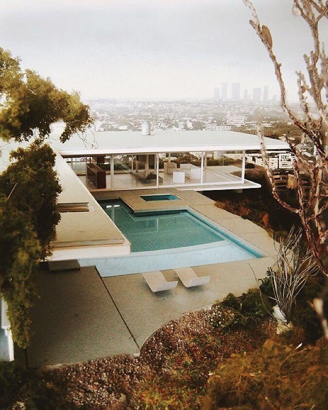
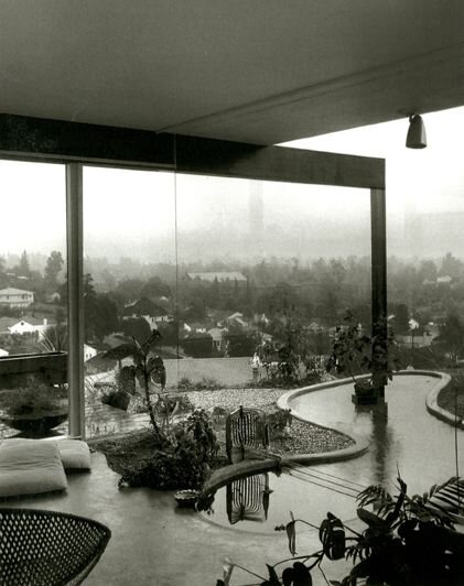
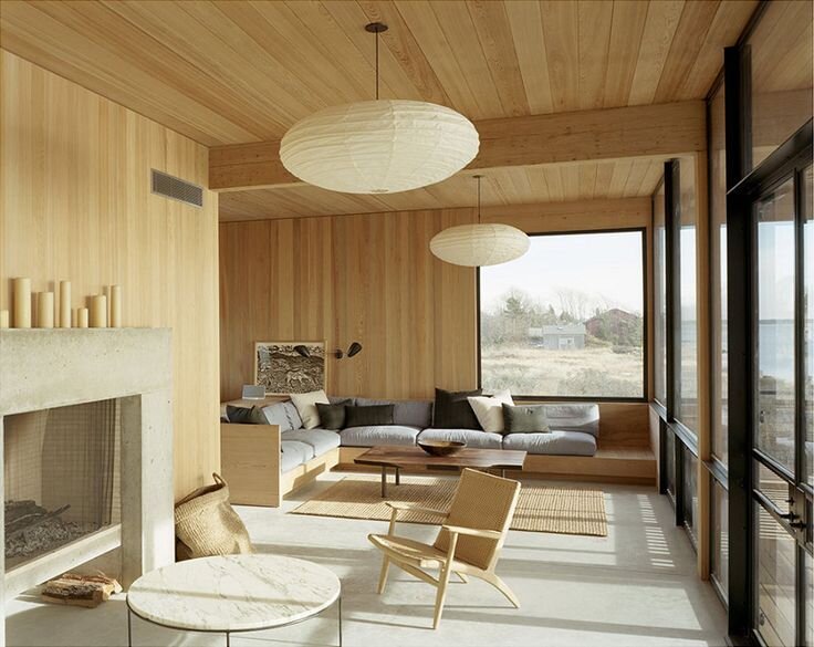
THE STAHL HOUSE, ARCHITECT PIERRE KOENIG, LOS ANGELES, CALIFORNIA 1960; THE CONSTANCE PERKINS HOUSE, ARCHITECT RICHARD NEUTRA, PASADENA, CALIFORNIA 1955

AMERICA
While today iconic MCM pieces are sold at high prices, important to recall the motivation of the movement was to bring good design to the masses. As soldiers returned home from WWII, thousands of track homes were built across the country to house them. These homes needed to be built quickly and cheaply, so architects relied on horizontal lines and clean open flow floor plans.

Did you know that the birthplace of the American mid-century modern movement was Michigan in the 1930’s? Yes, the design movement that reshaped virtually every aspect of American life was born in a suburb of Detroit on the lush campus of Cranbrook Academy of Art under the direction of Eilel Saarinen a 3rd generation Finnish architect. Saarinen directed Cranbrook as an experimental lab for his vision of fluid, humanist designs that were both modern and approachable. He adhered to the Bauhaus philosophy of gesamtkunstwerk which always sees an object within its larger context, and scales up to the next, and the next, and so on: “a chair in a room, a room in a house, a house in an environment, environment in a city plan.”

Under Saarinen, Cranbrook incubated many of the MCM’s most iconic pieces and birthed the careers of designers such as Charles & Ray Eames, Florence Knoll, Harry Bertoia, Alexander Girard, Alvar Aalto and his son Eero Saarinen.

From an interior design perspective, the furniture designs of this era were revolutionary in that pieces were no longer designed for a single purpose or room. Furniture was designed to serve multiple purposes, be easy to move and moderately priced. This was industrial design at its finest. Today, you can find mid-century modern pieces from IKEA to Crate & Barrel and DWR, but if you are looking for deep scholarship and rare finds Reform Gallery on Melrose is the place. Tell Gerard I sent you.

5dcc8bb53695cdc85ec27bd9f5cfd76c_saarinen-miller-house-1-19 (1).jpg

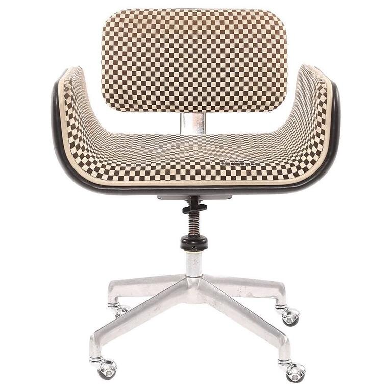
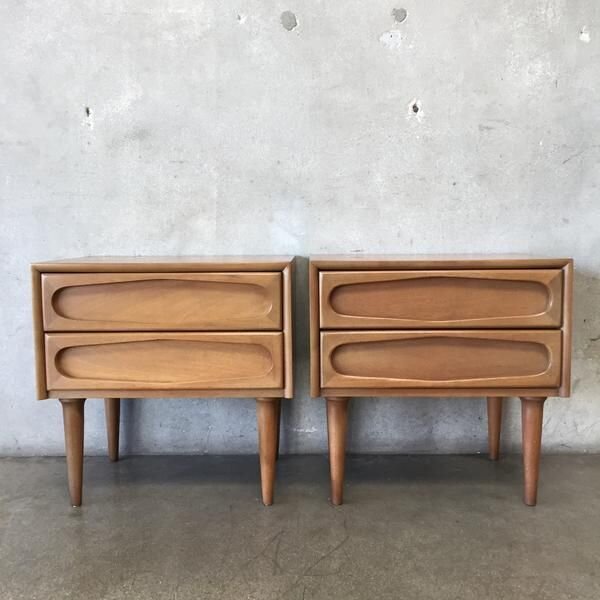
MILLER HOUSE, ARCHITECT EERO SAARINEN, COLUMBUS, INDIANA 1953; ALEXANDER GIRARD FOR HERMAN MILLER 1967; PAIR OF BEDSIDE TABLES, AMERICAN OF MARTINSVILLE

DANISH MODERN
Also inspired by the principles of Bauhaus modernism, Danish modern was launched in the 1920’s by furniture maker and architect Kaare Klint at the Royal Danish Academy of Art. Klint encouraged his students to abandon ornamentation in favor of form and consider the needs of daily modern life. He was also deeply committed to the warmth and beauty of traditional Danish cabinet making and forged creative partnerships with the Cabinetry Guild. This collaboration between architects and cabinetmakers is at the heart of Danish modern. The furniture and tableware from this period reflects the deep heritage of artisan craft in the region. Interesting to consider that industrialization did not come to Scandinavian until the 20th century, two centuries after it took root in Britain.

American retailers such as Sears and Woolworth saw the potential of Danish modern and started licensing designs in the 1950’s, adapting them to industrial production. After designer Finn Juhl created the interiors of the UN Headquarters in NYC, a more refined Danish modern aesthetic caught fire in the U.S. Scandinavian designers are often referred to as “soft modernists” due to their dedication to craft, the handmade and natural materials like wood and leather, which differentiate them from American modernists who enthusiastically embraced mechanical processes.

Materially, Danish modern designers worked with lightly colored woods like teak and oak. They used a 360-degree design methodology to ensure that the furniture looked good from every angle. Geometric and organic patterns are quite common given the movement’s emphasis on living in harmony with nature. My favorite feature of Danish modern furniture is the feminine rounded edges. I find curvaceous furniture soothes a space and makes it easier to move around. Scandinavian furniture designs tend to be lighter and more airy than American MCM, which make them a good fit for homes in Los Angeles.

While pieces from icons such as Hans Wegner, Finn Juhl and Arne Jacobsen are all the rage; I encourage clients to invest in lesser-known designers to cultivate originality in their MCM mix. In L.A., I recommend shopping at Danish Modern LA or keeping an eye on limited production pieces from Dana John.

IMG_2773.0.jpg
csm_06-Vitra-Design-Museum-Wegner-c-Hans-J-Wegners-Tegnestue_quadrat_0b757e2557.jpg

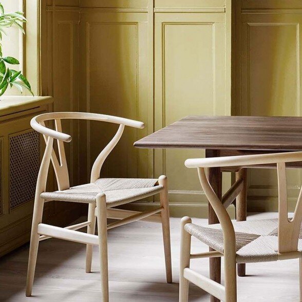
RESIDENCE, ARCHITECT ARNE JACOBSEN, COPENHAGEN, DENMARK 1950; CARL HANSEN CH24 & CH25; HANS J. WEGNER HOME, TINGLEVVEJ, DENMARK

BRAZILIAN MODERNISM
The world has been slow to recognize the artisanal and sensual style of Brazilian modernism and I am grateful for the dedication of the founders of
R & Company for helping to educate the design community of this rich heritage. They literally flew to remote villages in Brazil to track down long forgotten artisans! Brazilian modernism was not only a design movement, but also a cultural campaign of forging a new “post-colonial” identity and instilling a new social consciousness starting as early as the 1920’s. It was both an aesthetic and cultural revolution with the goal of infusing a global movement with Brasilidade, or Brazilianness. “Life in a hammock. Life as a hammock” was the guiding ethos.

The iconic works of Brazilian modernism by Oscar Niemeyer, José Zanine Caldas, Sérgio Rodrigues, Bo Bardi, and Joaquim Tenreiro call to mind utopian ideals, feminine curves and a pride in local cultural history. Uniting the aesthetics of Bauhaus with indigenous Brazilian materials and artisanship, the furniture is known for more generous proportions, low profiles, strong lines and richly colored tropical woods. Designers embraced and highlighted the grains of Brazilian rosewood and often used leather and woven fibers as a reference to the country’s rain forests and fishermen.

While the giants of Brazilian modern are not yet household names, their luscious take on Mid-Century Modern offers much for clients looking for a fresh twist. Highly recommend R & Company. in NYC and Thomas Hayes in L.A. as resources for Brazilian modern.

1920px-Palacio_da_Alvorada_Exterior.jpeg
Glass-House-Lina-Bo-Bardi-17.jpg

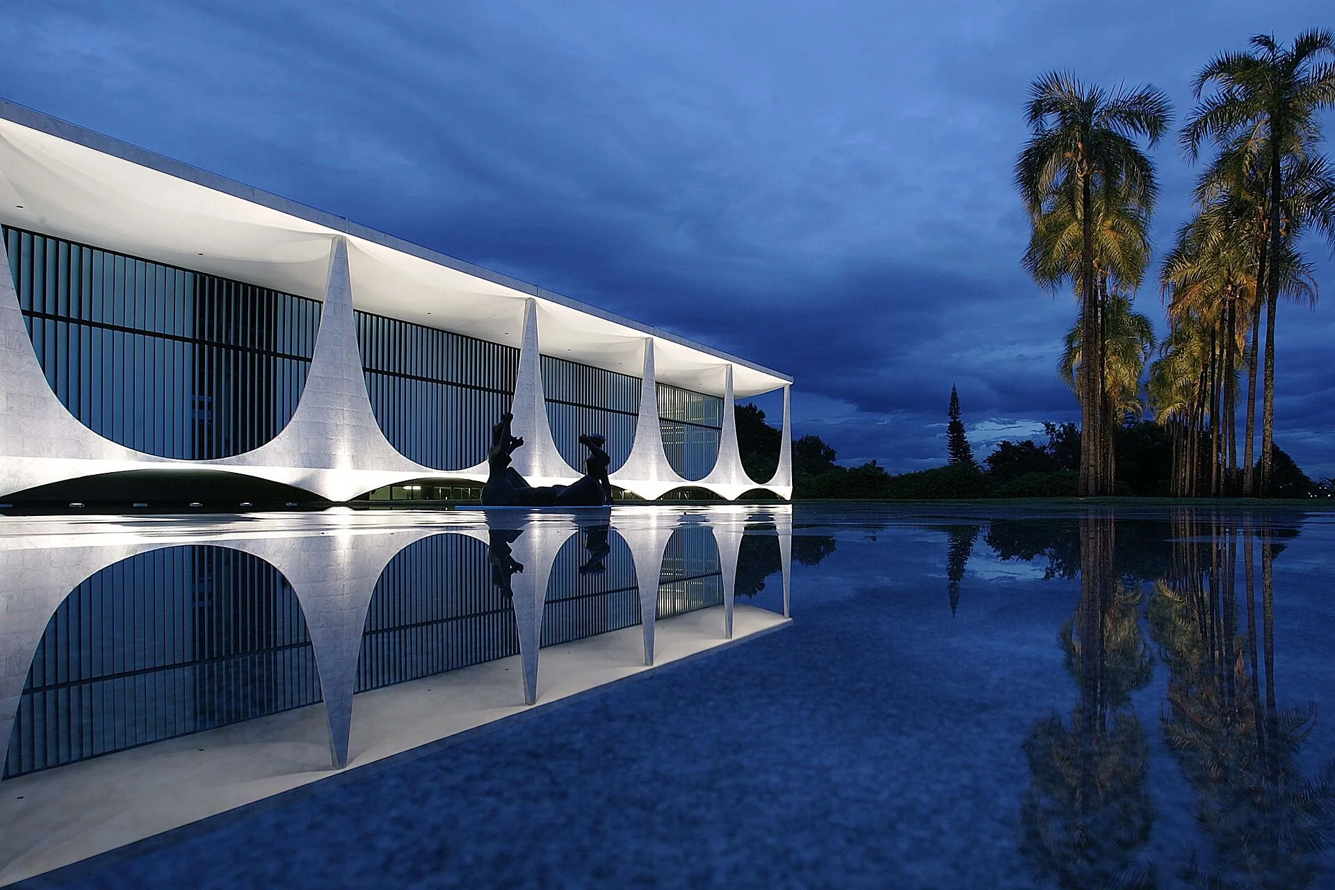
PALACE OF THE DAWN, ARCHITECT OSCAR NIEMEYER, BRASILIA, BRAZIL 1958; JOAQUIM TENREIRO, DINING SET 1954; JOSE ZANINE CALDAS, PAIR OF PEQUWOOD CHAIRS 1970; CASA DE VIDRO IN MORUMBI, ARCHITECT LINA BO BARDI, SAO PAULO, BRAZIL 1950

How is it that mid-century modern designs have been so resilient over the years? Can you think of someone that is NOT craving more simplicity and ease? The designs feel like a bridge between the past and the future. An aesthetic that keeps us in the present.

Until Next time -

1028f102-c4e4-40bc-9a22-30524ce0dd6a.jpg

DOCENT Briefing No.10 | Color Theory Simplified

Delta Wright

Hello and Welcome to DOCENT - your guide to design intelligence, creative solutions and earthly beauty. 

Today’s DOCENT Briefing is on creating sophisticated, rich color palettes without having to spend years studying color theory. An eye for color is an interior designers’ virtuoso skill and given the vast choices, it takes awhile to get comfortable wrangling color palettes. (Keep reading for my secret to creating rich color palettes.)
 

COLOR WHEELING
Color is a global, pre-verbal language that evokes emotion quicker than lightening. It can also overwhelm. I have nothing against a crisp white wall or creamy nook, but they pale in comparison to the power of a well conceived color palette. My favorite way to create sophisticated color palettes is to look to art, fashion and nature. Why reinvent the (color)wheel when painters, fashion designers and Mother Nature have already mastered the craft?

MIXOLOGY
Any master colorist will tell you that colors behave in three ways- they can be active, passive or neutral. First thing to decide is whether you want the décor to be dynamic or mellow. Interesting to note that monochromatic rooms can be done in both bold and soft colors with layering of textures, patterns and intensities. The key is to create tonal harmony by establishing a hierarchy of hues. Do you want to group several hues of light blue or contrast it with a deep turquoise? Strategic placement of neutrals – including black, grey, brown and white – is key to creating balance between active and passive shades.

COLOR STUDIES
Artists and designers of fashion and textile have spent decades sharpening their sense of color and their work provides rich inspiration for interiors. Consider a painting, fabric or fashion layout that soothes your soul or excites your eye. Slow down and really study the color palette. Which colors jump out at you, what color recedes into the background? The more time you spend looking at how colors interact, the more comfortable you will be working with color in your space.

COLOR MY WORLD
Twenty years of pouring over paint chips and fabric samples have felt like a meditation for me, but I understand others may not have the patience. Thankfully technology has made it easier to recreate the color palettes used in your favorite works of art. Here are a few examples of color palettes I generated from art and fashion that strike my fancy. Notice the artistry of layering hues and the visual power of creating contras

b4aad2b80a2370e8c740b34b72ced82d.jpg

PALETTES CREATED USING COLORMIND

Hope you enjoyed this DOCENT briefing on creating sophisticated and artful color palettes using art and fashion as inspiration. Upload images of your favorite artworks or fashion finds and see what you discover.

Until Next time -

Delta Sig.jpg