Delta Wright

DOCENT Briefing No.9 | Stowaway!

Delta Wright

Hello and Welcome to DOCENT - your guide to design intelligence, creative solutions and earthly beauty. 

Today’s DOCENT Briefing poses a challenge to rethink a household staple. Elemental to daily life, practical and so necessary - our CABINETS are the interior architecture within our exterior architecture. Rather than relegate them to the pantry or the back hall, let's consider ways to elevate their existence and presence in our homes. I say, let's celebrate them as the temples of our (joy-sparked) wares!

CONCEPT: Catch-All or Categorize
First, let's consider the greater storage strategy. I find it works best to assign categories to each cabinet location in the home. If you have a concept of what goes where, it is easier to tidy, easier to find what you're looking for and easier to look at the contents and know when streamlining is needed. If cabinets start to "catch-all", it becomes too overwhelming to manage these daily tasks.
Determine categories based on quantity and size of items to store and proximity to functions. For example, a bureau in the family room might hold family photos and keepsakes, while the bedroom hall might be the place for shared linens. Categories are also dictated by the over all quantity of storage cabinets you have. A solid household storage strategy provides peace of mind.

0c5f0ab88edea8aaefbb43ba86b46467.jpg

AMBER INTERIORS

SAVE YOUR SOUL
We've all read the books and the articles, seen the videos and listened to the podcasts telling us what contents we're supposed to keep and what clutter we're supposed to ditch. My advice is this: keep what you NEED, keep what you LOVE. Ask yourself how you FEEL about each possession from the smallest relic, to the eight bars of soap under the sink. Be honest with yourself and go with your gut. In this case, less is always more - because breathing room at home provides the space we need for our daily rejuvenation.

ANDRE PUTMAN; MCLAREN EXCELL; TSAI DESIGN

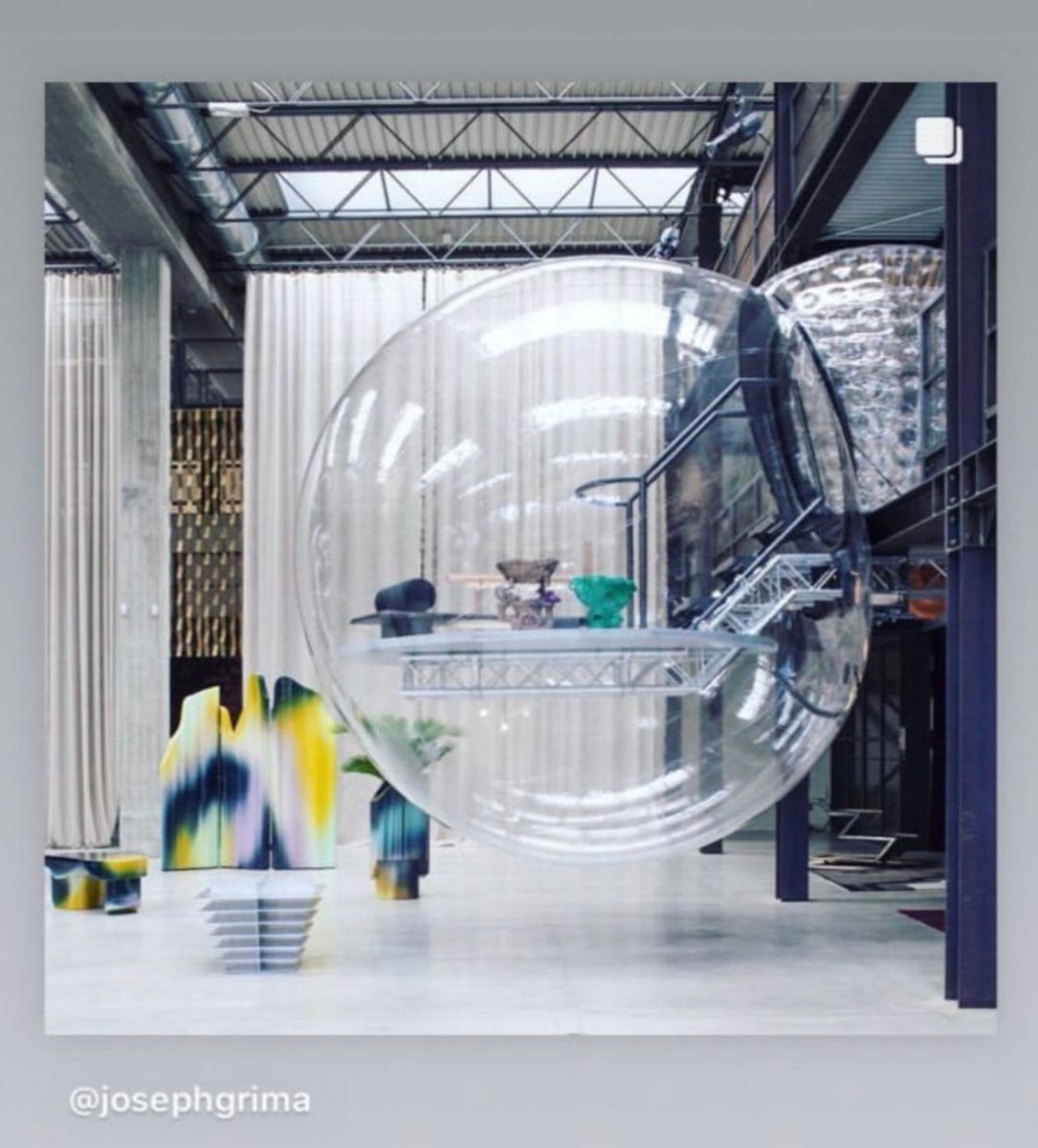
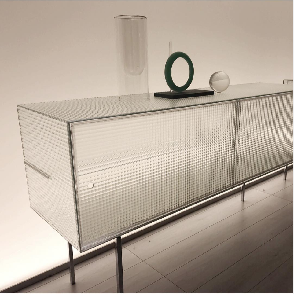
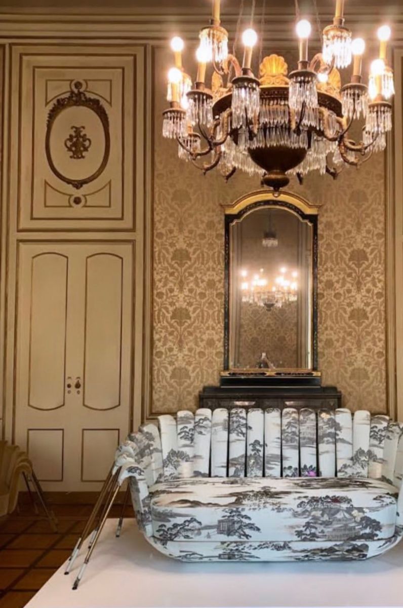
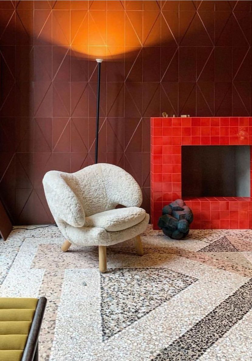
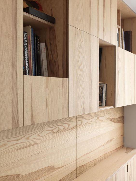
IMAGINE THE NEW: SHAPES AND FORMS
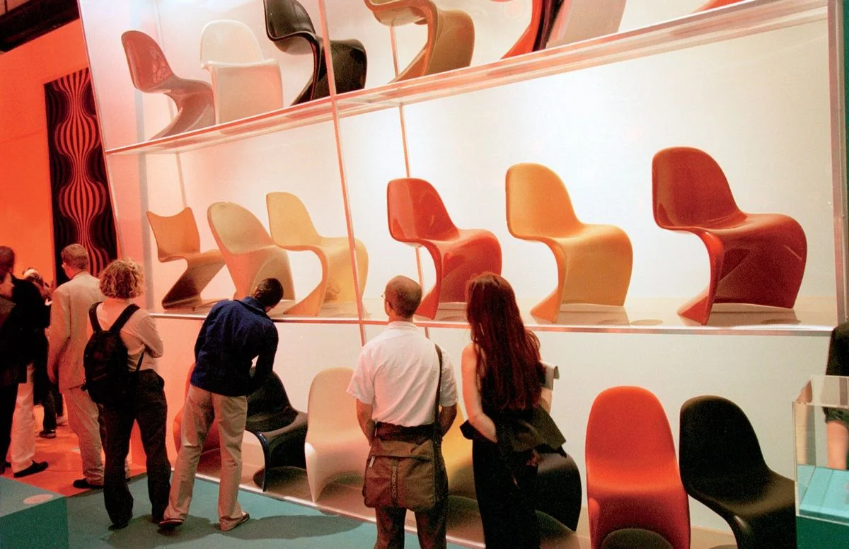
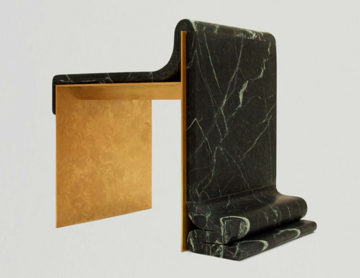
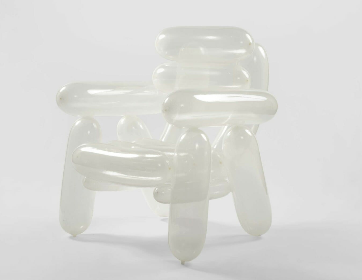
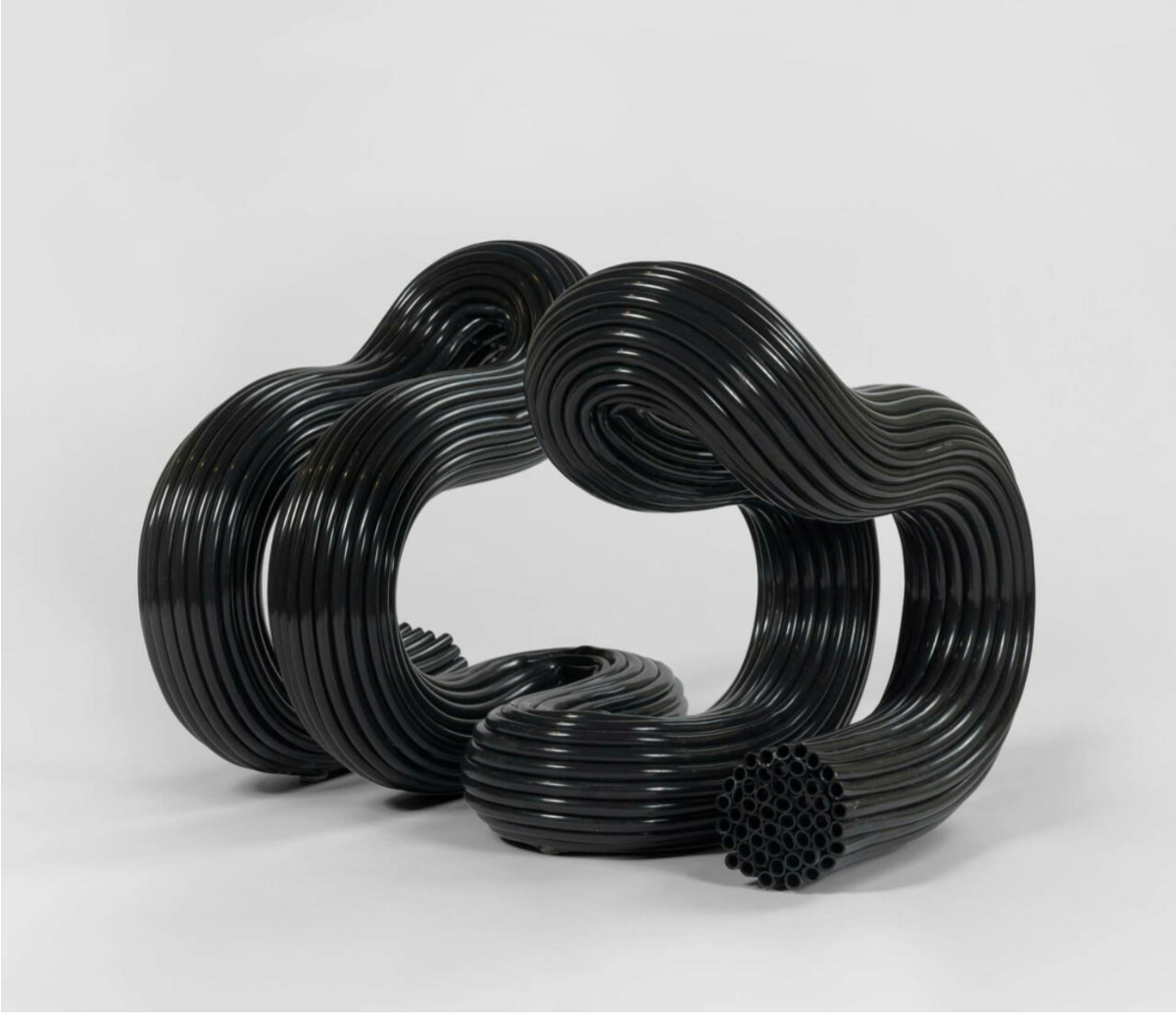
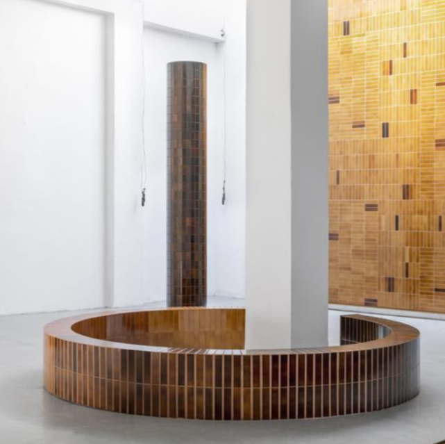
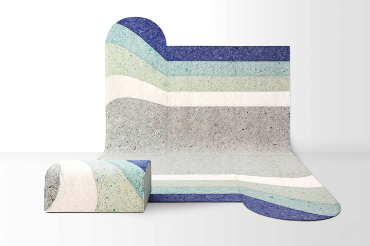
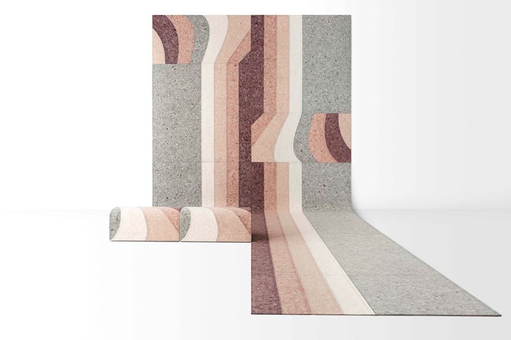
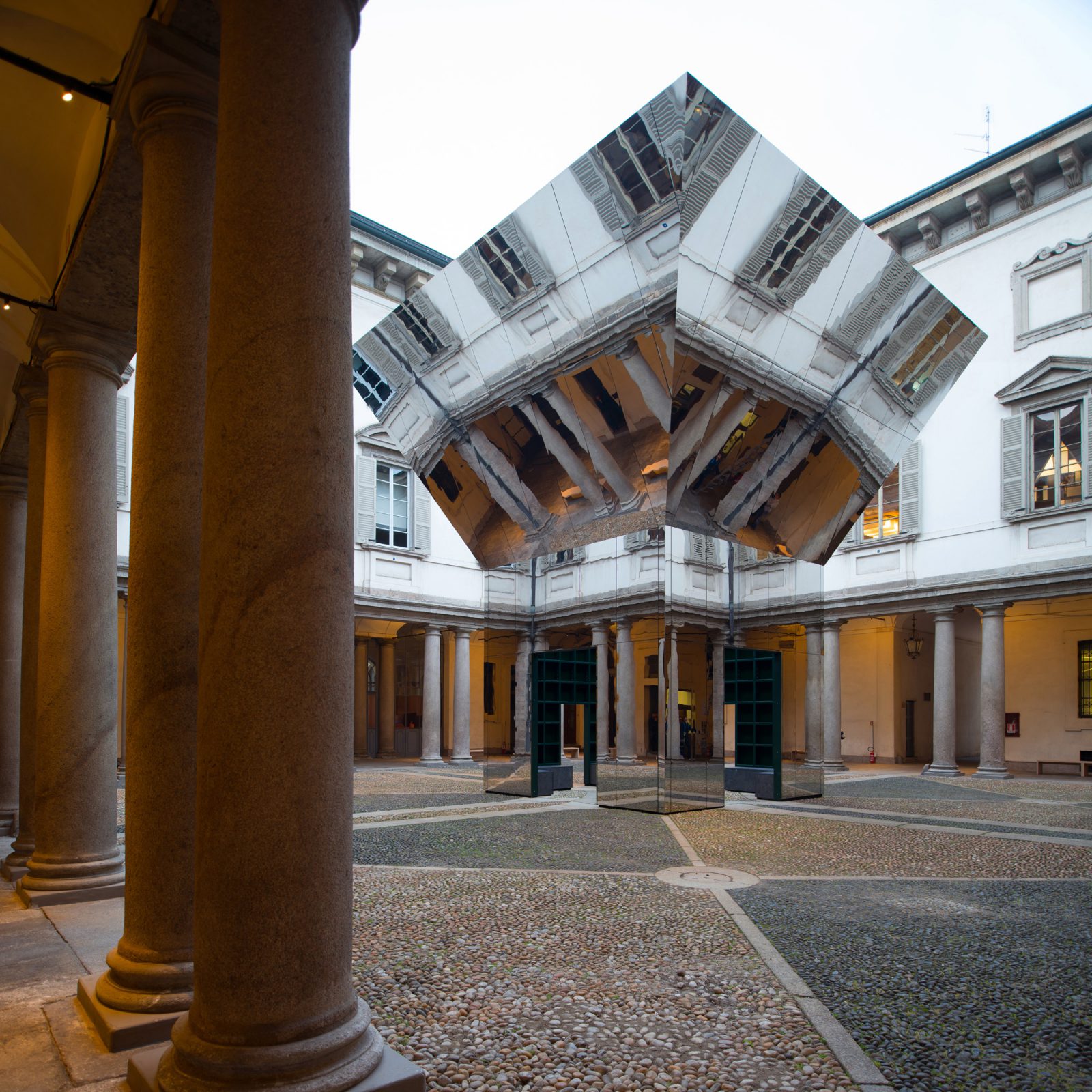
By nature, cabinets are rectangular boxes. The easy answer is to "line 'em up and make 'em economical". Yes! Tuck them away, blend them in. But with today's expanded and immediate home building techniques, why not design and create storage containment that honors not only the functional but the beautiful? The use of unexpected materials such as frosted glass and leather or the use of softened and playful shapes can enliven our homes and make the previously mundane now sing!

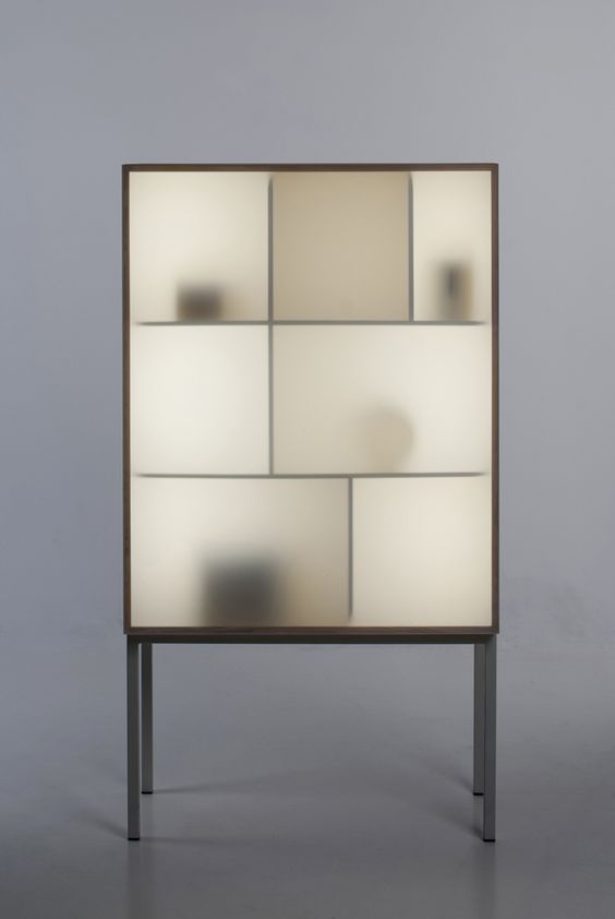
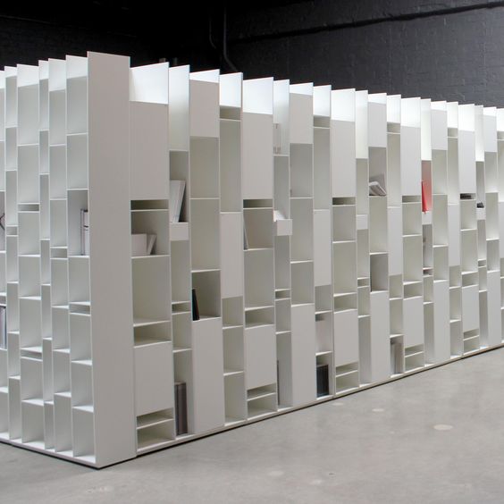
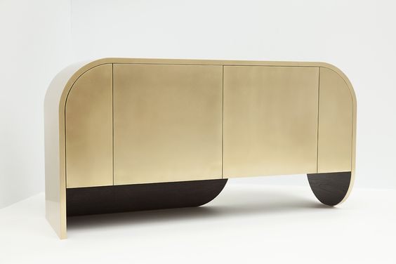
YABU PUSHELBERG; STINE KNUDSEN AAS; MDF ITALIA @GRAYELA; JONATHAN WEST

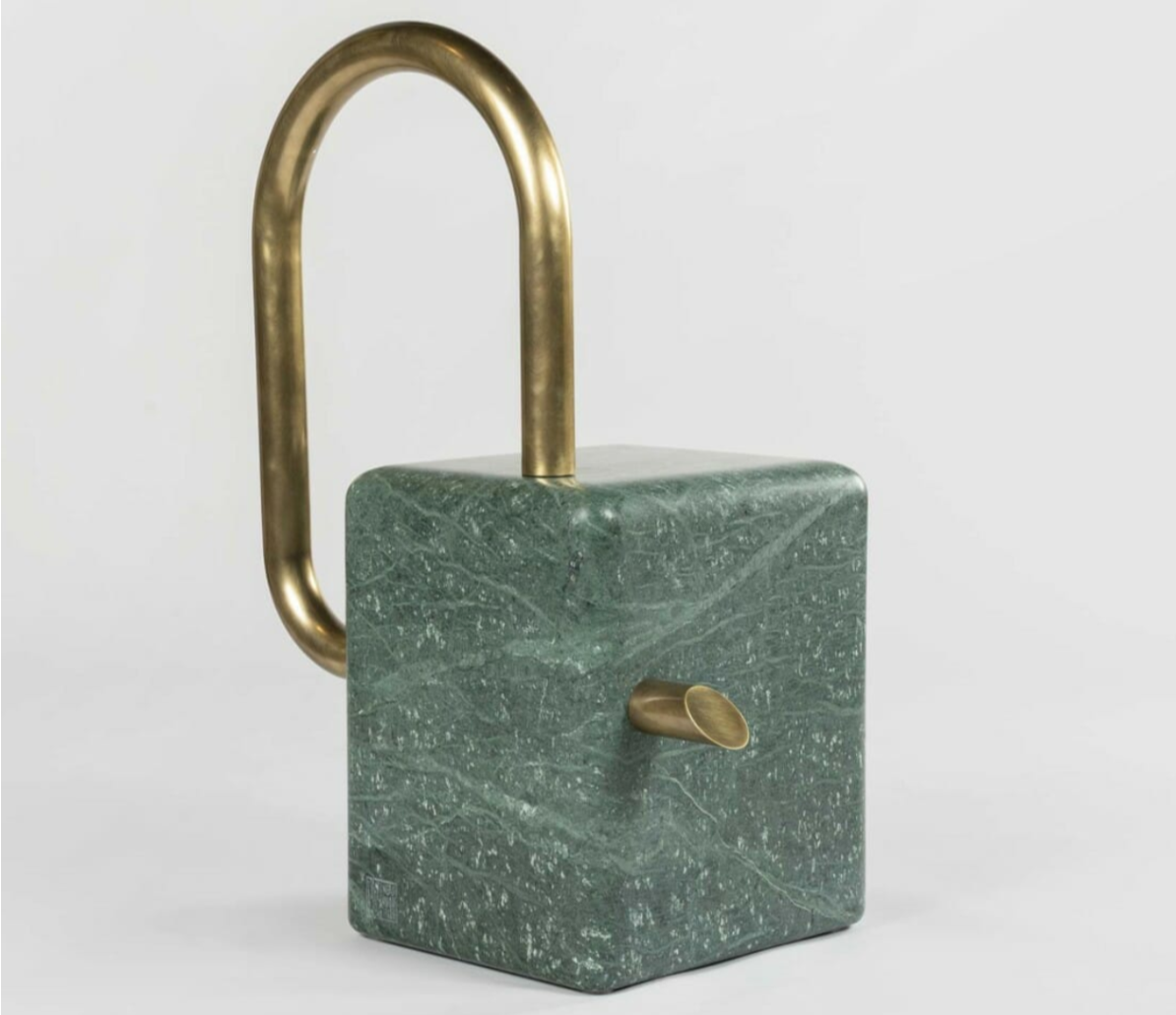
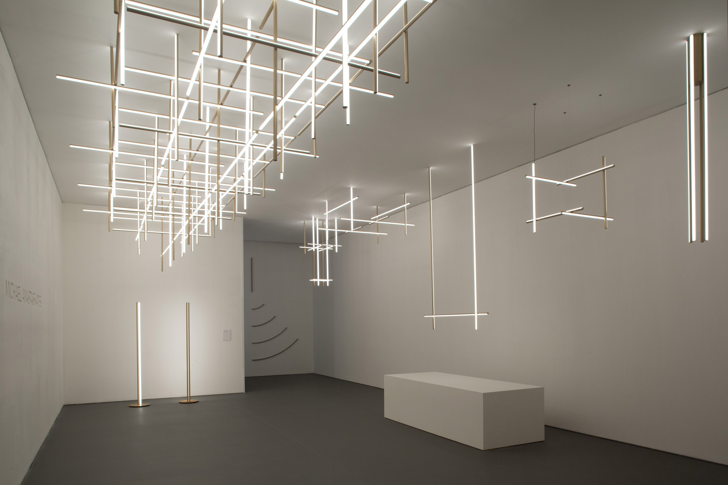
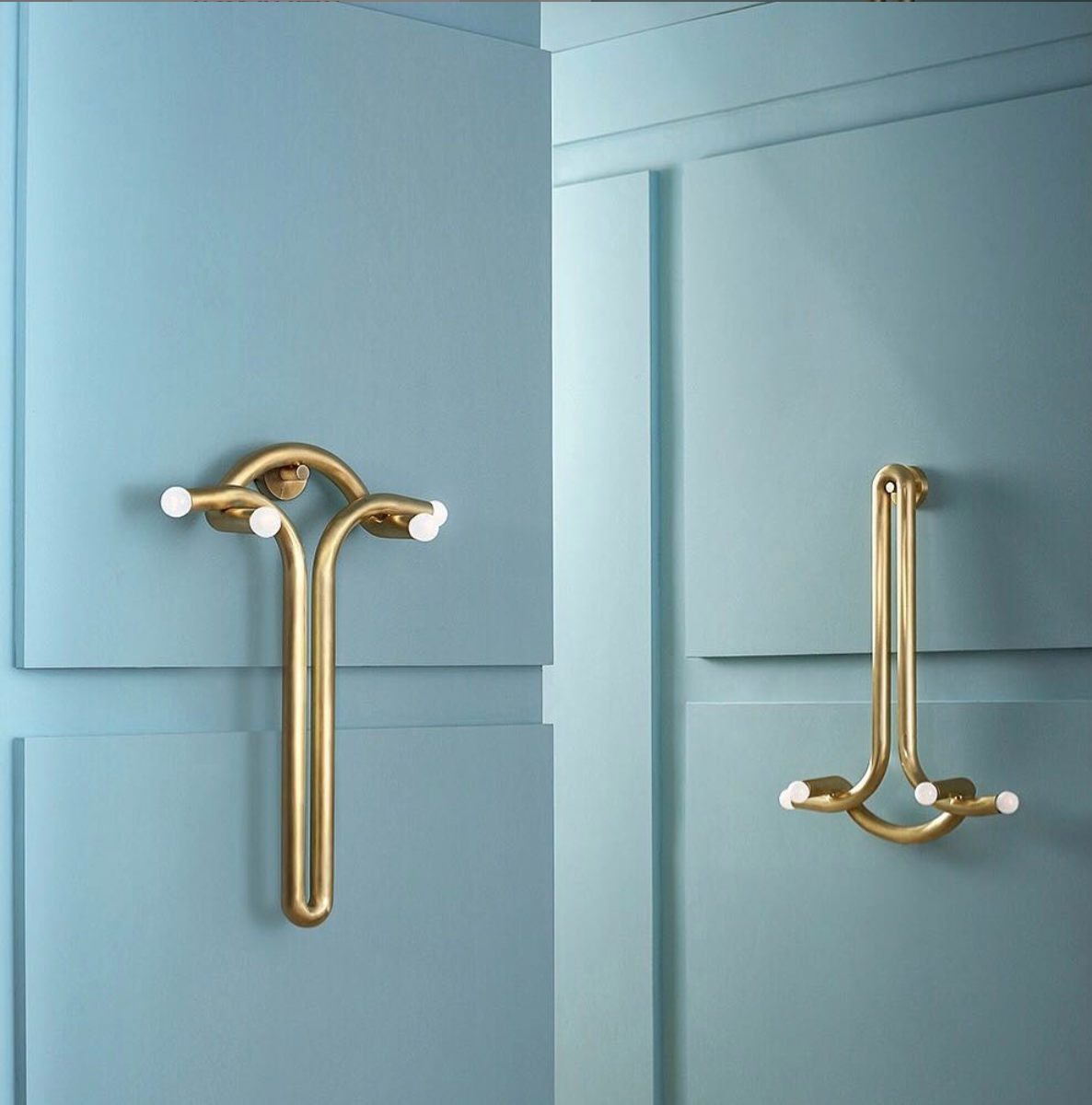
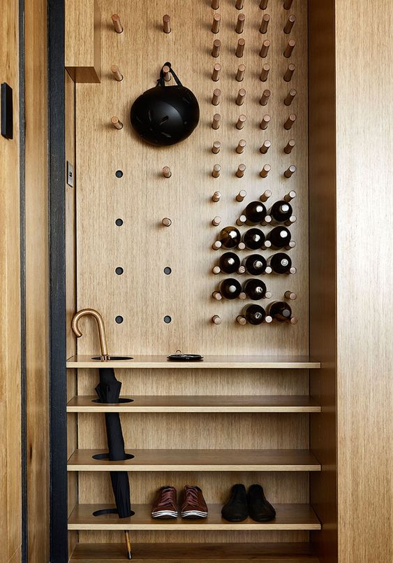
IMAGINE THE NEW: HARDWARE TO SEE AND FEEL
It's true that utilizing more complex shapes and materials for built-in cabinetry will require a higher budget. If this becomes a roadblock to revolution, consider putting more thought into knobs and pulls. They are touchstones. They inherently define how we engage with this important interior architecture.

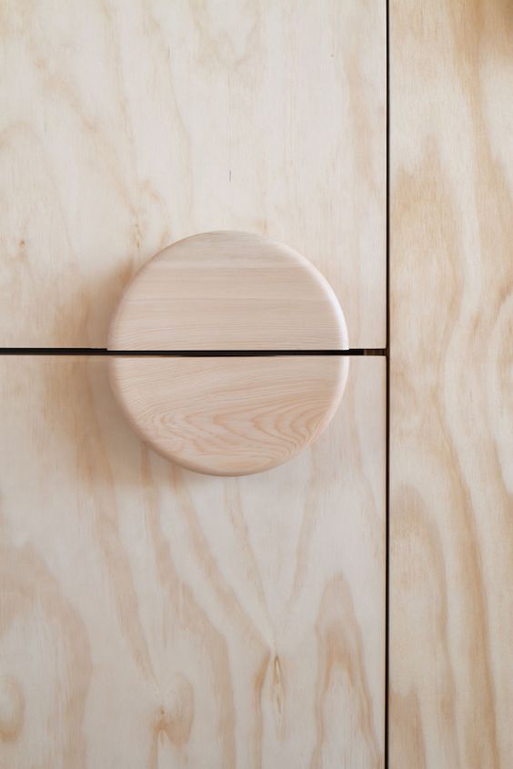
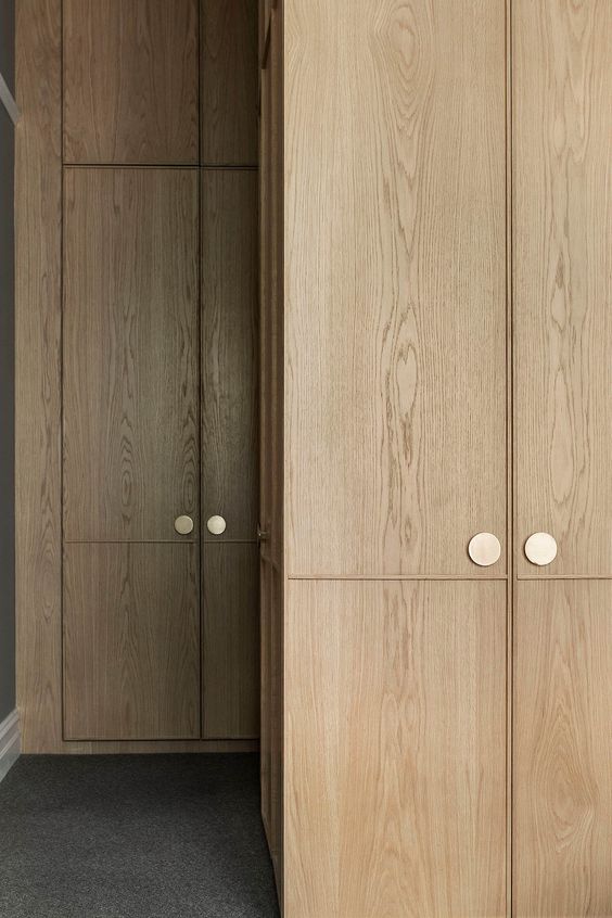
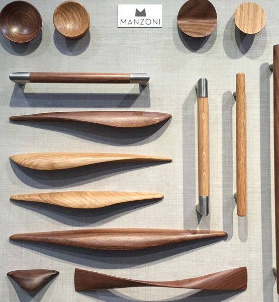
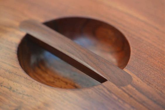
OOF! ARCHITECTURE; CJH STUDIO; MANZONI; JENS HARALD QUISTGARRD

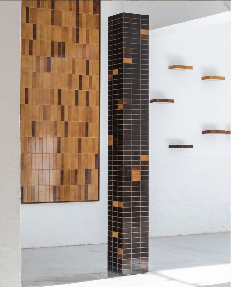
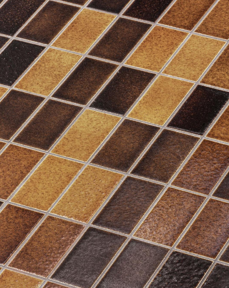
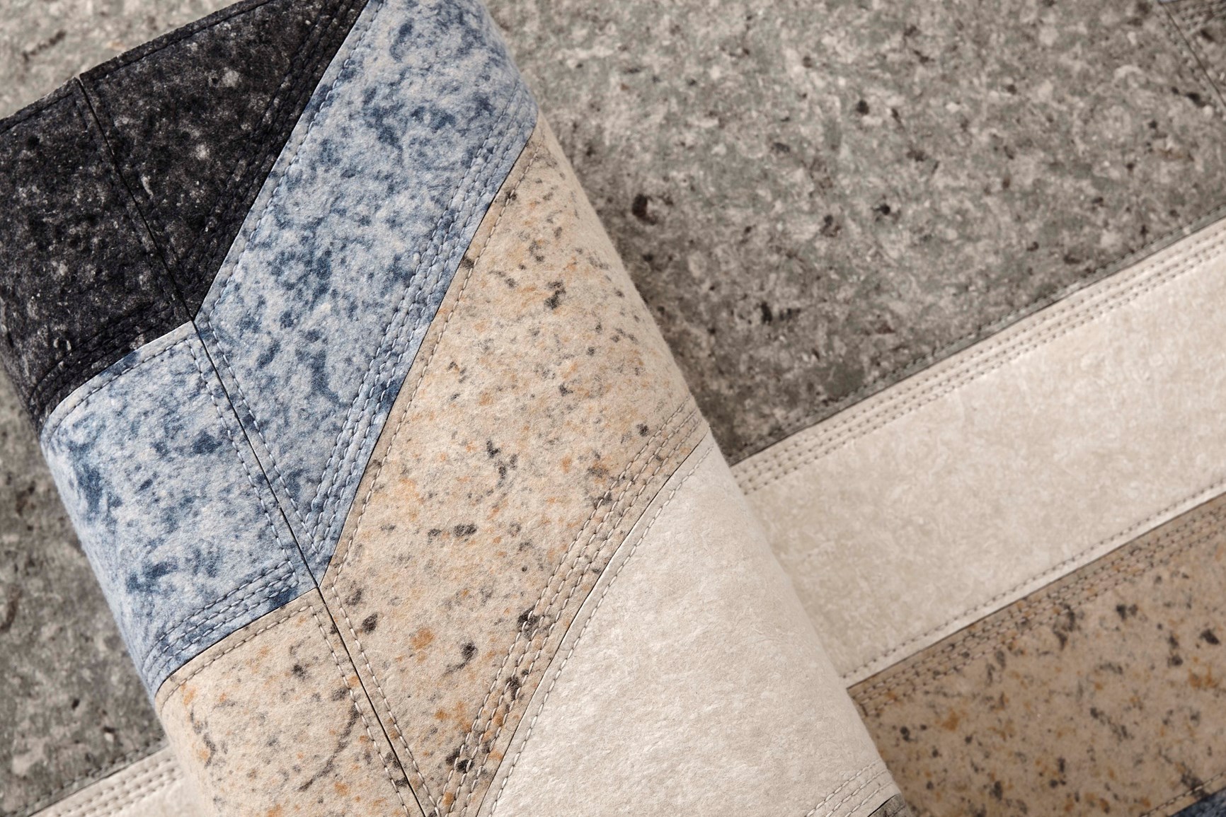
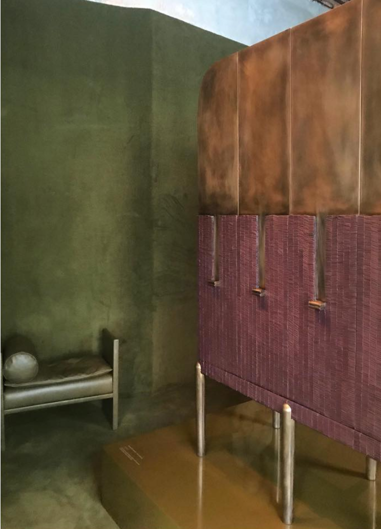
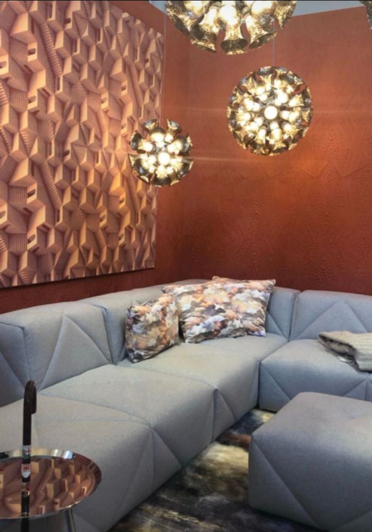
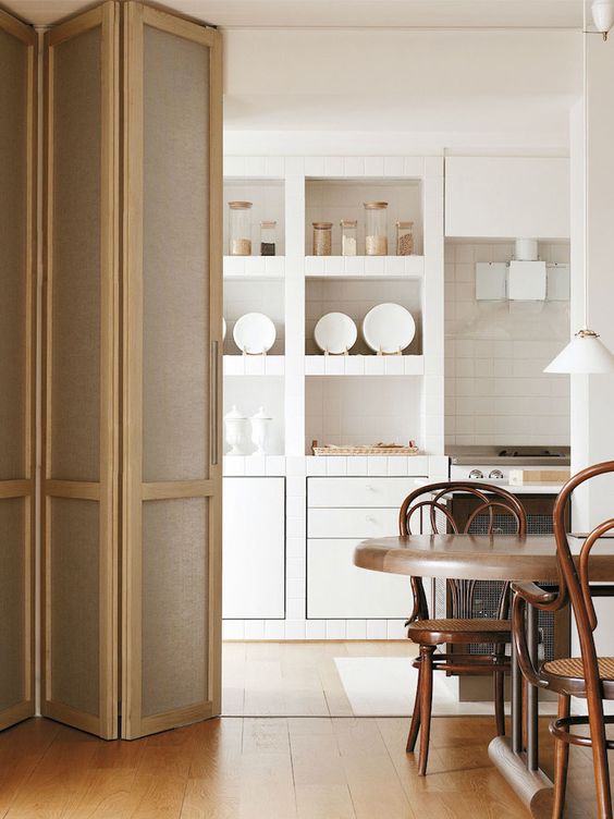
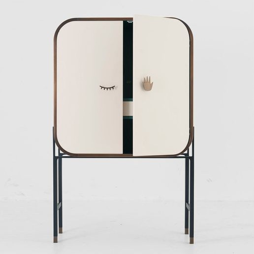
IMAGINE THE NEW: MATERIAL MATTERS
For centuries decorative painting, marquetry and the inlay of precious materials have been used to embellish our furniture pieces. It is time to explore incorporating modern translations of these treatments into the DNA of our built-in cabinets - from the front hall all the way to the upstairs linen closet. Incorporating mesh panels into doors is a way to permeate boring boxes. Doors fashioned from a three dimensional material can loosen the feel of a space while a subtle or textural mural always makes an appreciated contribution.

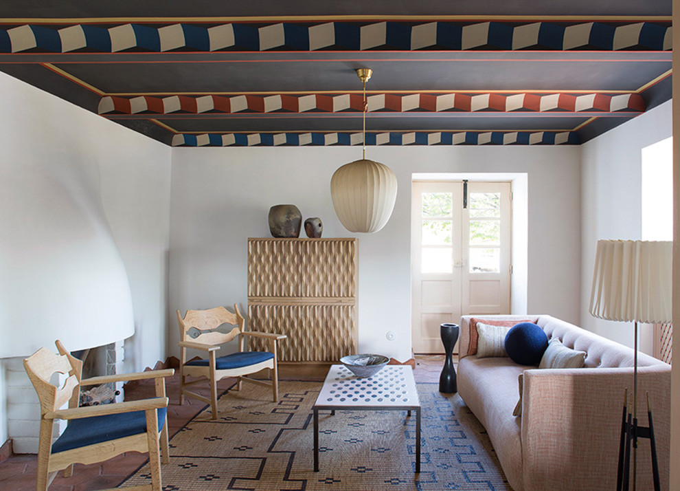
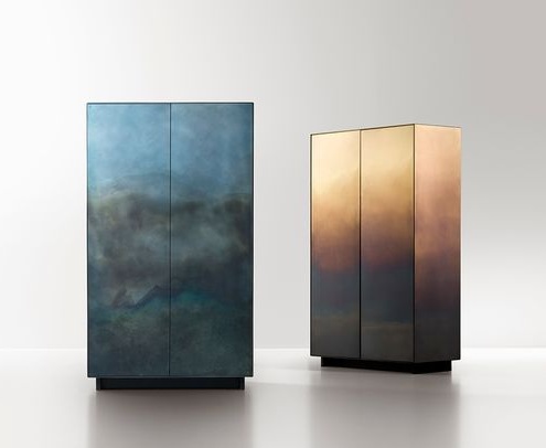
NINA MAIR ARCHITECTURE + DESIGN; PIERRE YAVANOVICH; DE CASTELLI; MORGAN CLAYHALL

For each home we inhabit, rather than draw rectangles on plans labeled "storage", why not dedicate time to relish these beautiful containers designed to stow the belongings we NEED and LOVE? This interior architecture within our homes should be considered as thoughtfully as the exterior architecture that contains it.

Until Next time -

Delta Sig.jpg

DOCENT Briefing No.8 | The Ultimate Interior Design "How-to"

Delta Wright

Hello and Welcome to DOCENT - your guide to design intelligence, creative solutions and earthly beauty. 

Today’s DOCENT briefing is on my mission to create “interiors that look and FEEL good” by incorporating the Principles of Interior Design. As a half-engineer/half artist, I can tell you that creative expression soars when you build on a solid foundation of design intelligence. 

This process of shaping the experience of a space draws on aspects of psychology, neuroscience, architecture and geometry. While every project requires hundreds of individual choices, these 6 Design Principles complement each other to strengthen the whole composition. To be clear, creating masterful spaces requires a mix of technical skills, creative confidence and intuition. Sophisticated interior design is less about “painting by numbers” and more like conducting an orchestra.  

Showing is the best way of telling, so now let’s move though these 6 Design Principles in practice. Notice how each designer shown makes the Principles her/his own while still working in a framework. 

1. UNITY:  A feeling of oneness - sense of flow
As the name implies, the principle of UNITY reminds us that there should be a sense of harmony among the elements used.  No matter the value of the individual elements, without visual unity a person will feel confused in a space lacking unity. All the elements used should complement one another and create a sense of flow in the space.  

In this DWID designed family room, the organic shapes and soft textures are juxtaposed against angular wood elements to create a sense of flow with the abundant views of nature. The design story for this project was “Luxury Treehouse” which helped us create unity throughout the large home. This sophisticated Parisian living room by Jean Louis Deniot beautifully demonstrates a sense of oneness through a color palette while playing with proportions and scale.

1 unity.png

Delta Wright Interior Design and Jean Louis Deniot Interiors

2. EMPHASIS: an accentuation of importance - a focal point
I think of the principle of EMPHASIS as a dose of WOW factor.  An accentuation that generates interest and draws the viewer in. A well-designed room will have at least one focal point that should make a lasting impression. Some spaces have natural focal points such as a large window or a fireplace. Artwork or an accent wall are also excellent ways to create emphasis.  

In his living room, Parisian designer Pierre Yovanovitch anchored the room with a literal artwork of an eye by Mark Quinn above thefireplace. Across the globe in Sydney, in this pared down modernist home by Robson Rak a wall was blasted out to extend the eye towards nature.

2 emphasis.png

Robson Rak Architects and Designers and Pierre Yovanovitch Architecture

3. RHYTHM: an orderly repetition of an object or element
In music, it’s the beat, the pulse that keeps us humming along. In interior design, rhythm is all about visual pattern repetition. The rhythm can be tight and precise, or a progression of color or size. Rhythm creates a sense of visual movement that leads the eye from one design element to another.

In this casual family room by Vincente Wolf, a backdrop of vintage shovels spaced apart equally provides both visual interest and serenity. In this vignette by The Rug Company, a progression of ceremonial African masks matches the beat of the lush Zebra pattern rug.

3+.jpg

Vincente Wolf Interiors and The Rug Company

4. CONTRAST: a juxtaposition that accentuates differences
Even a subdued space needs a dose of contrast to bring it alive. Contrast allows designers to emphasize or highlight key elements in the space.  The juxtaposition can be subtle or bold - the goal is to keep things interesting and aligned with overall feel. I will say that high contrast requires some risk-taking, but the more you do it the more exciting it becomes. Brazilian architect and designer Sig Bergamin is know for his fearless approach to layering a kaleidoscope of colors, textures, textiles and art. Here he hung a large Chinese figurative painting on geometric wallpaper to accentuate the difference in shapes. On the other hand, in this Richard Mishaan designed living room simply hanging two large color abstraction paintings in a formal setting loosened up the space.

4+contrast.jpg

Sig Bergamin Interiors and Richard Mishaan Design

5. SCALE/PROPORTION: a scaling of objects in relation to each other
Proportion is all about context. Mathematicians, scientists and philosophers have long been fascinated by relational patterns found in nature and human bodies. You don’t have to be Leonardo da Vinci to observe the appeal that comes from visual harmony. The Golden Ratio of 1.618 proportional increments is considered to be the key for beauty and used widely as a guide. In both these examples, various widths and heights are used in proportion to the objects next to each other. The differences in scale are noticeable, yet pleasing.

5 proportion.png

6. BALANCE: a distribution of equal weight
All 6 Design Principles are connected and contribute to “the whole being greater than the sum of its parts”. Change one tiny thing in a room and you can throw off the balance of the rest of the design elements. Balancing the visual and emotional weight in a space is at the heart of interior design. Note there are different kinds of balance. Traditional interiors usually follow symmetrical balance where objects and furnishings are repeated on each side of a vertical axis like this pristine example from Warren Platner Design. Asymmetrical balance is a more fluid, organic experience of equal visual weight, yet also harder to achieve.

6 balance.png

London based designer Hubert Zandberg artfully balances textures, shapes and color in this living room.

There are endless ways to apply these 6 Design Principles and that is what I love about my work. I side with the Ancient Greeks who saw the desire for beauty and harmony as a universal value. Creating spaces that “look and FEEL good” is my way of contributing to a more harmonious world.

Until Next Time -

1028f102-c4e4-40bc-9a22-30524ce0dd6a.jpg

DOCENT Briefing No.7 | Sit On It

Delta Wright
e48c09af-e75e-4b9f-a340-5787dd95be87.jpg

Hello and Welcome to DOCENT - your guide to design intelligence, creative solutions and earthly beauty. 

Today’s DOCENT Briefing explores the birth of modernity through the emergence of Easy Seats - and what happened next. Note: My anecdotal account of the early days of interior decoration are derived from the wonderful book by Joan DeJean entitled The Age of Comfort When Paris Discovered Casual and the Modern Home Began.

THE AGE OF COMFORT AND THE FIRST SOFAS, 1670-1720
Before Louis XIV and his mistresses began their lifestyle revolution which embraced a new comfort and casual styles, there were only a few types of furniture being used in homes. "Furniture" (from the Latinmobilis, mobile, or that which can be moved) was designed to travel when relocation became necessary due to war, famine or disease. But in seventeenth-century France, creating softened, padded, upholstered props for living became part of a flurry of furnishings innovation which brought with it a new posture and physical pose. The comfortable and expansive sofa beckoned and encouraged a behavior previously unheard-of. Reclining with legs stretched comfortably allowed for a new state of ease. Looser clothing styles even evolved to support this new way of sitting. With the advent of the sofa, the joy of lounging came to be.

8bce5083-7736-484c-81de-abab85ed9df4.jpg

Jean-Francois de Troy The Declaration of Love c.1720
The softened wings of the sofa (called joues, or cheeks, in French) allow for a place to rest the cheek.

ICONIC CHAIRS, 1950-1970
Flash forward, the iconic chair becomes a symbol of imagination and practicality fused, becomes a relic of functionality and beauty, becomes individualist sculpture. These chairs are elemental. In the 20th century, these chairs dutifully serve their function, yet come to represent a pared-down essence and artistic flair.

0547fcef-f76c-4a56-9634-78405c0b65e7.jpg
8fb72356-15a8-44f5-b48a-0ed60e337fc1.jpg

Pantone Stacking Chair ;  Eames LCW ;  Mies Van Der Rohe Barcelona Chair ;  Platner Arm Chair

THE CHAIR FOR CHAIR'S SAKE, 2019
The Chair, a current exhibit at the New York contemporary design gallery THE FUTURE PERFECT indicates that the chair has been fully liberated. Its history is no longer relevant, its function is optional and subjective. The chair can now capitalize on its integral iconic status to make a statement, to present a thought or to ask a question. Perhaps in our time, The Chair is more a modern platform for discussion -  than a seat.

As a young student, I remember my distaste when a drafting teacher looked over my shoulder at my decorative furnishings sketches. They were creative, yet admittedly a mish-mash of styles and details. There were sofas and wallcoverings, cabinets and window fashions galore. “You can’t just make them up! After all, there is nothing new under the sun”, she declared. How dare she! ... wasn’t each idea a vision newly conceived? Fresh to be explored? “She must be terribly mistaken and certainly dead inside”, I concluded.

Today I'm pleased to note, that although she was probably more correct than not, she had only been correct for about 400 years.

1028f102-c4e4-40bc-9a22-30524ce0dd6a.jpg

DOCENT Briefing No.6 | Eye Spy

Delta Wright

Hello and Welcome to DOCENT - your guide to design intelligence, creative solutions and earthly beauty.

Today’s DOCENT Briefing highlights 5 contemporary artists that recently caught my eye. They inspire me aesthetically and intellectually. Art preferences are highly personal and each choice reveals a bit of the person’s worldview. Here is a peek into mine.

SECUNDINO HERNÁNDEZ | b. 1975 Madrid, Spain
My craft-based education reveals itself in multiple ways including my interest in process. Secundino Hernández's large-scale paintings require a process-oriented approach that involves both rehearsal and surrender. His paintings are hard to characterize, as they are hybrids of figuration and abstraction, linear draftsmanship and intuitive color painting, minimalism and gesturalism. I particularly like the architectural scale of his “washed paintings” created by layering and then removing paint with a heavy-duty pressure washer. These large-scale canvases require great physicality on the part of the artist. Wielding the industrial pressure washer to carve through layers of dried pigment to expose raw canvas is akin to sculpting. The resulting works feel archaeological, like weathered walls in an old town square or an urban area long abandoned. These paintings act like a dramatic repository of collective memories.

Images courtesy the artist and Victoria Miro Gallery

ORLAN | b. 1947 Saint-Étienne, France

The pioneering vision of French artist ORLAN has shaped pop culture from Instagram selfies to Lady Gaga (a lawsuit continues…). Her five decades of multi-disciplinary art making has revolved primarily around self portraits. To say ORLAN has taken control of her own image and body is an understatement. In the 1990’s she underwent 9 plastic surgeries to “resculpt” various facial features based on famous artworks created by male artists. ORLAN has made her body her medium as a tool for her own liberation. If a woman’s body is to be controlled by politics and religion, taking back control is an act of freedom, no? I admire her complete commitment to her art and her utter disregard for orthodoxy. Her extensive self-portraiture has given me a wider perspective on how often identity is “performed”. She challenges many preconceived notions of art making and female empowerment. ORLAN’s radical perspectives keep me on my toes.

Images courtesy the artist

CHRISTINA QUARLES | b. 1985 Chicago, Il
In contrast to ORLAN who has made a career of precisely sculpting her identity, Los Angeles based artist Christina Quarles revels in ambiguity. With painterly virtuosity, Christina captures the contradiction of her identity, appearance and beliefs. Mistaken racial and sexual identities (she is a queer-identifying African American artist with fair skin) fuel her erotically charged paintings full of converging bodies. Visually, it is often hard to tell when one figure ends and other begins, but the desirous nature of the scene is unmistakable. Her large-scale acrylic paintings feature ubiquitous humans floating amongst crisp objects and patterns. Christina’s enigmatic works can feel unsettling at times, but also an opportunity to remind myself that things are not always what they seem.

Images courtesy the artist

CHRIS ANTEMANN
My affinity for minimalism in architecture is balanced out by my love of objects with implicit narratives. I also appreciate a good sense of humor and a get a kick out of romantic fantasies, so naturally fell in love with Chris Antemann. This unique artist has taken 18th century porcelain figurines and turned them into contemporary telenovelas. Using literary techniques to frame a narrative, Chris builds layers upon layer of story details - often loaded with social parody. The artist infuses 18th century social scenes of elaborate dinner parties, picnics, garden parties and courtship rituals with her wicked sense of humor. Scantily clad male and female figures with coquettish grins set in decadent scenes of the rich and famous grace her delicately painted sculptures. While she employs Rococo aesthetics, the seductive undertones of her characters are more modern. A favorite work is Forbidden Fruit Dinner Party (2013), where socialites gather around a table snacking on ripe fruit while hungrily gazing at their male companions. I enjoy Chris’ playful approach to documenting the shifting male/female dynamic and appreciate her skill in marrying design and concept so masterfully.

Images courtesy the artist

ALEXANDRA GRANT | b. 1973 Fairview Park, OH
As a songstress I know the power of a powerful lyric to catalyze emotion, so text-based artist Alexandra Grant felt like an artistic cousin the first time I saw her work. The L.A. based artist uses language and collaborations with writers as source material for her paintings, drawings and sculptures. Alexandra’s multi-disciplinary works are less a facsimile of the source material and more maps of emotion, meaning and symbolism. Her work explores translation from text to image, from 2D to 3D, from spoken to unspoken. The images in Alexandra’s work are familiar to us, yet each of us will “read” them differently adding layers of meaning based on our own frame of reference. Much of Alexandra’s work is based on long-term collaborations, or conversations, with writers and thinkers, including the hypertext fiction of Michael Joyce, the photography of the actor Keanu Reeves, and the work of French philosopher Hélène Cixous. If you are in L.A., you have likely run across Alexandra’s philanthropic grantLOVE project, which produces and sells limited edition works to benefit artist projects and arts non-profits. These works make great gifts!

Images courtesy the artist

I hope you enjoyed learning more about art that inspires me to think and feel
more deeply. Curious to hear which one of the five was your favorite.

Until Next time -

1028f102-c4e4-40bc-9a22-30524ce0dd6a.jpg

DOCENT Briefing No.5 | A Quantum Trip to the Fair

Delta Wright

Hello and Welcome to DOCENT - your guide to design intelligence, creative solutions and earthly beauty.

Today’s DOCENT Briefing highlights my favorite captures from Salone del Mobile 2019. Hint: This year I relished the excitement of Milan in real-time through the eyes of my brilliant friends and colleagues via Instagram - while I opted for family time on the Oregon Coast and the beaches of Tamarindo, Costa Rica. It was just the quantum leap I needed to take!

DESIGN WEEK DARLINGS

FORMAFANTASMA: My intensive “studio years” spent garnering a B.F.A. in Glass and Ceramics before moving on to study Interior Design have always propelled me towards craft-conscious, chic artists who get their hands dirty and let the materials lead. This explains my ongoing attraction to Amsterdam-based design duo FORMAFANTASMA. Their installation/creation/collab with Dzek was visually rich and minimally austere. "Ex-Cinere" is a series of refined volcanic-ash-glazed tiles suitable for both interior and exterior surfaces, from bathrooms to façade cladding. Here are some quotes from Andrea and Simone about this work...
"We always think that, as designers, we have to decide things, but the world also decides things for us. In this case, the ferrous colours and final tile format were determined by Mount Etna. Volcanic ash is the grainy aftermath of molten magma that has erupted from under the planet’s crust. We’d been considering pastels and almost artificial colours, but these tones are more like life, and they bring back a quality that’s disappearing in architecture, which is the non-uniformity of colour."

MICHAEL ANASTASSIADES: Long term Flos collaborator Michael Anastassiades created a new lighting system called "Coordinates". The system consists of horizontal and vertical strip lights that form custom illuminated grid-like structures across ceilings. A second lighting system by Anastassiades, called "My Circuit", is made up of simple individual curved and linear sections that can be joined together to create custom configurations. Mounted on the ceiling, the curved sections can be used in tandem with five pendant fixtures which are fixed along the track. As Michael's most adoring fan, I always look forward to the reveal of his next works.

Screen Shot 2019-04-23 at 5.55.45 AM.png

PATRICIA URQUIOLA: Speaking of "Nuances", her collab with Gan Rugs: "While felt is typically a winter material, we worked with colors and patterns with a terrace effect to make surfaces lighter, less dense. The waves, the stripes, the color gradients are my ‘obsession’: they’re part of an aesthetic research that began with marble some years ago, and I’ve now transferred to different materials, from wood to fabrics."

VON ELLRICHSHAUSEN + DE CASTELLI: I consider blurring the lines between Art, Architecture, Interior Design, Sculpture and Experience - my life's mandate. Chilean duo PEZO VON ELLRICHSHAUSEN + DE CASTELLI have mastered this skill with their installation called "ECHO" at Palazzo Litta. "This mysterious object inspires a sensitive adherence between the interior and exterior settings...The exterior of Echo, covered with a mirrored surface, reflects the baroque colonnade and the two upper orders that make up the courtyard of the building. In contrast, the interior reveals the sky, a natural element isolated from the city. The installation establishes a relationship between art and architecture announcing the surrounding environment through a visual echo. It’s an open object, both restricted and expansive, visible and invisible, solid and ethereal. It’s a deceptive artifact and a form that resonates with the dimensions and proportions of the courtyard”. The pavilion alternates between appearances, reflections, and disappearance”. At ground level visitors encounter an unprecedented version of the monument, by looking up they see themselves reflected on an impressive tilted ceiling. Upon entering into the central room, into a massive steel grid frame, the weight of the historical architecture.

NILUFAR FROM HERE

Discovering, Crossing, Creating...

Nina Yashar's Nilufar Depot is a magical place. On my first visit to this fantastical furniture gallery (opened en masse in 2015), I was breathless for nearly two hours - snapping over 200 pictures while taking in a completely unique vista of composition, color, material and detail at each turn or even slight shift of my eyes. This year's exhibitions proved no different. Experienced only through myriad camera lenses the exhibitions and compositions still left me breathless. Deprived of physical touch this year, I found myself collecting more back story on this design world wonder. Here I selected a few translated excerpts from the Nilufar website...
"Nilufar gives life to projects, editions, site-specific shows and publications, working both with great masters and emerging authors. Nilufar has its own small manifesto, composed of three words: Discovering, Crossing, Creating. The history of taste is a never-ending exercise of decomposition and re-composition, just like a kaleidoscope... Milan is an interesting lab and a privileged point to observe the euphoric and restless scene of design."

db34a599-b9a1-441c-8e7c-9cf92e6b20e4.jpeg

FUTURE RELICS

A collection of furniture pieces with presence and poise captured my feed and became instantly timeless. A single curving tube flows into the form of a chair (Atelier de Troupe), folded leather strips create a dense, decorative surface (Apparatus) and translucent glass forms structures to envelop space (Glas Italia).

8a1a626b-d684-4d13-85f4-cbbef451cfd0.jpg

YOU LIGHT UP MY EUROLUCE

Euroluce, the International Lighting Exhibition, runs every two years since 1976 and presents the most innovative solutions in the field of light for interiors. At this 29th edition, it is recognized as the global benchmark lighting exhibition, where technological innovation and design culture take center stage. My eye is always captured by glowing sculptural specimens and unusual floating forms. Here are a few favorites I collected as their stories passed by...

VIVACIOUS VIGNETTES

Colors and textures, patterns and materials, modern innovations next to primal classics intertwining and overlapping at every turn. For me, a favorite pastime while at the Milan furniture fair is to visually study these design relationships in their astonishing - if only temporary - habitats.

Using Instagram as my instrument of quantum mechanics, this year my "trip to Milan" was as stunning as ever. Perhaps the filtered and edited view even better? Of course, the experience moves far beyond only the visual senses (hello, risotto), so I could never forego the in-person visit completely. But for a change this year, a little remote beach time with my device in-hand undoubtedly provided the best of both worlds. PURA VIDA!

If you enjoyed this DOCENT Briefing and you were at the fair this year, send me a note with your favorite finds. I'd love to see even more treasures through your eyes!

Until Next time -

1028f102-c4e4-40bc-9a22-30524ce0dd6a.jpg

SPECIAL THANKS to my LOVE @graye_la who escorts me to the fair and keeps me attuned to the highest order of beauty year round. If you see anything in this post you'd like to inquire about, call GrayeMaria Cicione and her team will guide you.

BRAVO and GRAZIE to my REAL-LIFE Instagram friends @saradt  @natashabaradaran@abfabgram  @gc_collaborative  @gardeshop  @arielfoxdesign and @rum_idfor their perspectives and captures from this year's Salone del Mobile in Milano, Italy.