Hello and Welcome to DOCENT - your guide to design intelligence, creative solutions and earthly beauty.
Today’s DOCENT Briefing is on creating sophisticated, rich color palettes without having to spend years studying color theory. An eye for color is an interior designers’ virtuoso skill and given the vast choices, it takes awhile to get comfortable wrangling color palettes. (Keep reading for my secret to creating rich color palettes.)
COLOR WHEELING
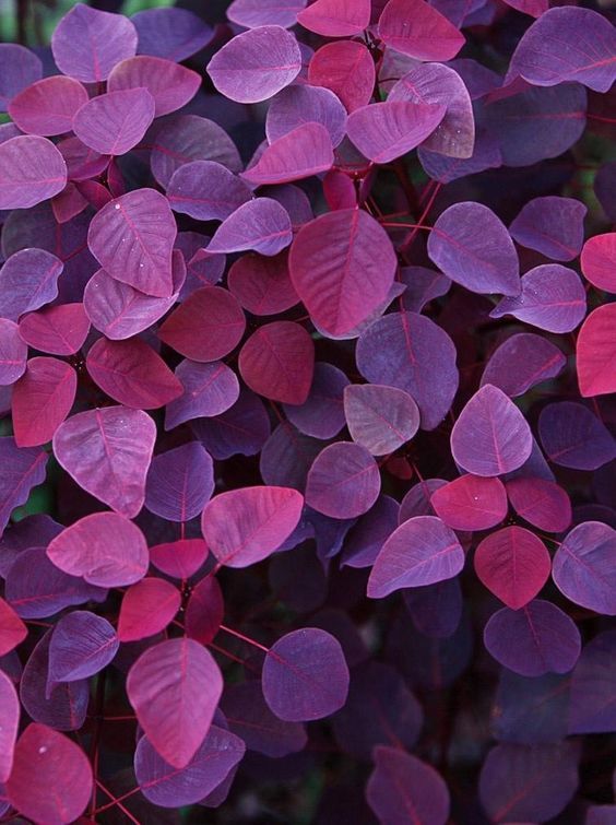
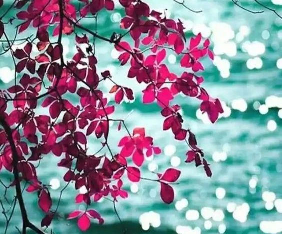
Color is a global, pre-verbal language that evokes emotion quicker than lightening. It can also overwhelm. I have nothing against a crisp white wall or creamy nook, but they pale in comparison to the power of a well conceived color palette. My favorite way to create sophisticated color palettes is to look to art, fashion and nature. Why reinvent the (color)wheel when painters, fashion designers and Mother Nature have already mastered the craft?

MIXOLOGY
Any master colorist will tell you that colors behave in three ways- they can be active, passive or neutral. First thing to decide is whether you want the décor to be dynamic or mellow. Interesting to note that monochromatic rooms can be done in both bold and soft colors with layering of textures, patterns and intensities. The key is to create tonal harmony by establishing a hierarchy of hues. Do you want to group several hues of light blue or contrast it with a deep turquoise? Strategic placement of neutrals – including black, grey, brown and white – is key to creating balance between active and passive shades.

COLOR STUDIES
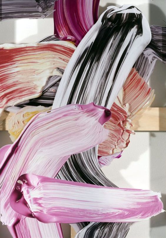
Artists and designers of fashion and textile have spent decades sharpening their sense of color and their work provides rich inspiration for interiors. Consider a painting, fabric or fashion layout that soothes your soul or excites your eye. Slow down and really study the color palette. Which colors jump out at you, what color recedes into the background? The more time you spend looking at how colors interact, the more comfortable you will be working with color in your space.
COLOR MY WORLD
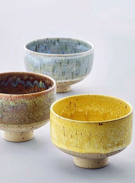
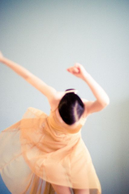
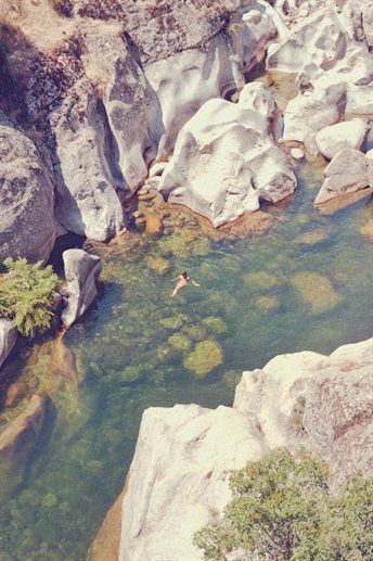
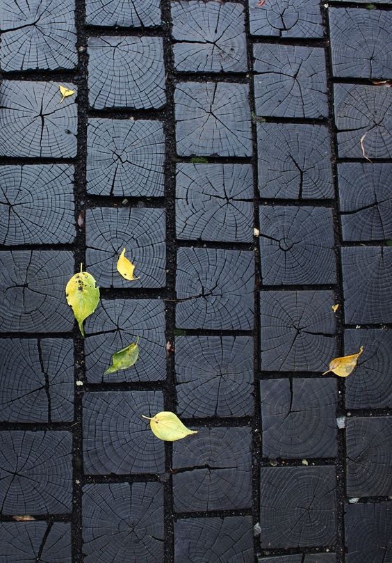
Twenty years of pouring over paint chips and fabric samples have felt like a meditation for me, but I understand others may not have the patience. Thankfully technology has made it easier to recreate the color palettes used in your favorite works of art. Here are a few examples of color palettes I generated from art and fashion that strike my fancy. Notice the artistry of layering hues and the visual power of creating contras

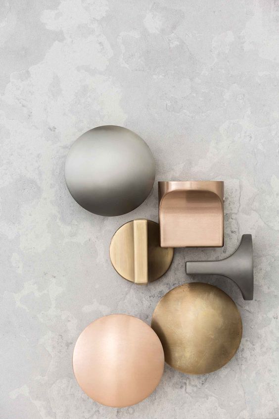
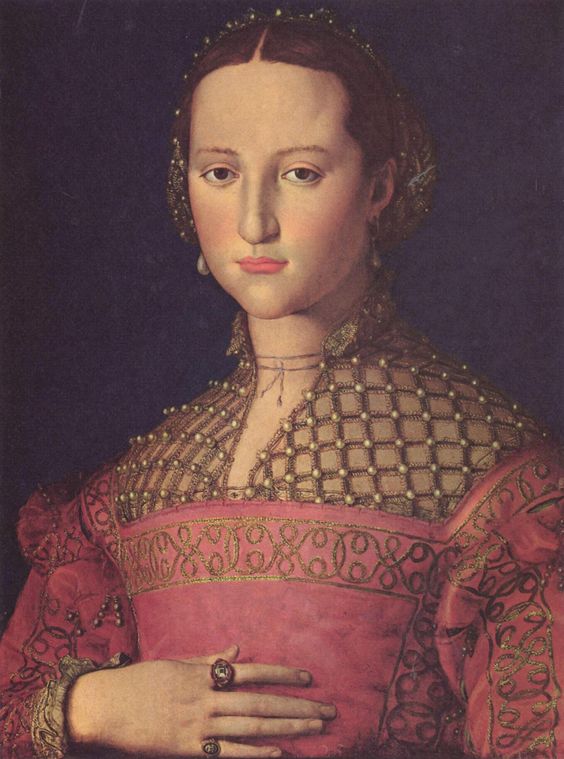


PALETTES CREATED USING COLORMIND
Hope you enjoyed this DOCENT briefing on creating sophisticated and artful color palettes using art and fashion as inspiration. Upload images of your favorite artworks or fashion finds and see what you discover.
Until Next time -
